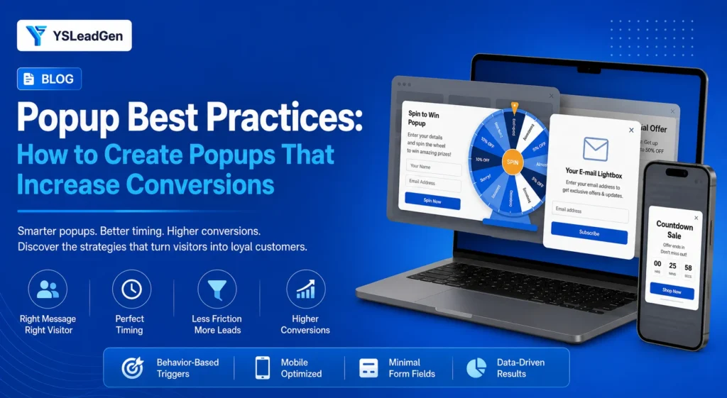
If you have ever installed a popup plugin on your website only to watch visitors immediately close it, you are not alone. Popups have a bad reputation, but the truth is: popups still work incredibly well when used correctly. The problem isn’t the popup itself; it’s how websites use them. Most businesses interrupt visitors with generic discount offers seconds after they land on a page, before they have built any trust or received any value.
To increase conversions without annoying your visitors, your strategy needs to shift from “interrupting” to “helping.” A successful website popup should act like a helpful salesperson—appearing exactly when a visitor shows interest, providing something genuinely useful, and making their next step easier.
In this guide, we break down 25 proven popup best practices for WordPress, WooCommerce, and online businesses. You will learn how to master timing, match offers to the customer journey, avoid common mistakes, and turn your popups into powerful conversion tools that respect the user experience.
If you have ever installed a popup plugin on your WordPress website, you probably know the feeling. You create your first campaign, add a discount offer, choose a nice looking design, and wait for the conversions to come in. You imagine more email subscribers, more enquiries, and more sales from the visitors who are already landing on your website.
But after a few days, the results are not what you expected.
Visitors are closing the popup without reading it. Your signup numbers are lower than you hoped. Your discount campaign does not create the sales boost you expected. Eventually, you start asking the same question many website owners ask: are popups still effective, or are they simply annoying people?
The truth is that popups still work.
The problem is not the popup itself. The problem is how most websites use them.
Many businesses treat popups as a way to grab attention as quickly as possible. They show a message within seconds of a visitor arriving, display the same offer on every page, and ask people to subscribe or buy before they have any reason to trust the website.
That approach usually creates the exact opposite result.
A visitor does not dislike a popup because it appears. They dislike it when it appears at the wrong time, offers no real value, or interrupts what they were trying to do.
Think about how a helpful salesperson behaves in a physical store. They do not walk up to every person who enters and immediately ask them to make a purchase. They first understand what the customer is looking for, answer questions, and provide assistance when the customer needs it.
A successful website popup should work the same way.
It should appear when a visitor has shown interest, provide something useful, and make the next step easier.
For example, a person reading a WordPress tutorial may not be ready to purchase a service, but they may happily download a free website maintenance checklist. A customer comparing products in a WooCommerce store may not need another newsletter form, but they may appreciate free shipping information, product recommendations, or a buying guide that helps them make a decision.
The difference between an effective popup and an annoying popup is understanding the visitor behind the screen.
Every person who visits your website arrives with a different goal. Some visitors are discovering your brand for the first time. Some are researching before making a purchase. Some are returning customers who already know your business and need a small reason to take action.
When websites ignore these differences, popups become interruptions.
When websites understand them, popups become conversion opportunities.
This is why the best performing websites do not focus on showing more popups. They focus on creating better popup experiences.
They think about the visitor’s journey before creating the campaign. They consider what information the visitor needs, what problem they are trying to solve, and what action makes sense at that specific moment.
A WooCommerce store selling premium products may use a popup to help customers choose the right product instead of immediately pushing a discount. A WordPress agency may use a popup to offer a free website audit instead of simply asking visitors to contact them. A content website may use a popup to provide a deeper resource related to the article someone is already reading.
The popup becomes useful because it feels like a natural next step.
In this guide, we will explore the popup best practices that help WordPress websites, WooCommerce stores, and online businesses increase conversions without damaging user experience. You will learn how to plan popup campaigns, choose the right timing, create better offers, avoid common mistakes, and turn more visitors into subscribers, customers, and long term followers.
Why Most Popup Campaigns Fail Even When Websites Have Good Traffic
One of the most frustrating situations for a website owner is seeing traffic growth without seeing conversion growth.
You may spend months creating content, improving your SEO, running advertising campaigns, and bringing new visitors to your website. The numbers in Google Analytics look positive. People are arriving, pages are being viewed, and your brand is getting more visibility.
But when you look at the actions that actually matter, something feels missing.
Visitors are not joining your email list. They are not requesting information. They are adding products to their cart but leaving before completing their purchase.
This is where many businesses turn to popups.
The idea makes sense. If thousands of people are visiting your website but leaving without taking action, why not create another opportunity to connect with them?
The mistake happens when businesses focus only on capturing visitors instead of understanding them.
A popup is not a magic tool that converts every visitor who sees it. It cannot fix unclear messaging, weak offers, poor website experience, or a lack of trust.
It only works when it supports a visitor who is already moving toward a decision.
Many unsuccessful popup campaigns fail because they treat every visitor the same. A person discovering your website for the first time is shown the same message as someone who has visited five times. A customer looking at products worth hundreds of dollars receives the same popup as someone reading a beginner guide. A visitor who is ready to buy sees the same message as someone who is still researching.
The website may have good traffic, but the popup does not understand the person behind that traffic.
The Real Problem Is Usually Not the Popup, It Is the Timing
Timing is one of the biggest reasons popup campaigns succeed or fail.
A visitor needs a certain amount of time to understand your website before they are ready to respond.
Imagine someone finds your blog through Google while searching for a solution to a problem. They click your article, start reading, and within three seconds a popup appears asking them to subscribe.
At that moment, the visitor has not received any value yet.
They do not know whether your advice is helpful. They do not know whether your website is trustworthy. They have not even finished understanding why they landed on the page.
The popup is not appearing because the visitor is interested.
It is appearing because the marketing tool has been configured that way.
This small difference changes the entire experience.
Successful websites use timing based on behaviour.
A visitor who has scrolled through 70 percent of a detailed article has shown interest. Someone who has viewed multiple products in a WooCommerce store has shown buying intent. Someone who moves their cursor toward the browser close button may need one final helpful message before leaving.
The best popup timing is not about finding a universal number like five seconds or thirty seconds.
It is about recognizing signals that show a visitor is ready for the next step.
The Difference Between Interrupting Visitors and Helping Them
The best popup strategies are built around one simple idea:
Help first, ask second.
This sounds obvious, but many websites do the opposite.
They ask visitors for their email address before building any relationship. They promote a discount before explaining why the product is valuable. They push a sales message before answering the questions that stop customers from buying.
A popup should not feel like a website trying to take something from the visitor.
It should feel like the website is offering something useful.
For example, imagine a WooCommerce store selling skincare products.
A basic popup might say:
“Join our newsletter and get 10% off.”
There is nothing wrong with this offer, but it does not address the customer’s uncertainty.
A better approach would be:
“Not sure which skincare product is right for your skin type? Get our free product selection guide.”
The second popup understands the customer’s situation.
The visitor may not be avoiding the purchase because they do not want a discount. They may simply need more confidence before making a decision.
This is why successful popup campaigns are built around customer psychology, not just promotional messages.
Your Popup Should Match the Stage of the Customer Journey
Every visitor is somewhere on a journey.
Some people are discovering your brand for the first time. Some are comparing options. Some are ready to buy. Some have purchased before and may become repeat customers.
A single popup cannot serve all of these situations effectively.
A first time visitor may need a reason to remember your business.
A helpful resource, newsletter, or beginner guide can work well here.
A visitor comparing products may need more information.
Reviews, comparison guides, demonstrations, or product recommendations can remove hesitation.
A customer who has already purchased may respond better to loyalty rewards, new product announcements, or exclusive offers.
This is where many websites miss opportunities.
They focus on creating a popup campaign, but they do not think about who will see it.
The best websites ask a different question:
“What does this visitor need right now?”
That question changes everything.
Why Generic Popup Messages Usually Underperform
A lot of websites still use the same basic popup copy:
- “Subscribe to our newsletter.”
- “Get updates from us.”
- “Join our community.”
These messages are simple, but they are not very persuasive.
The visitor already knows what you want.
They know you want their email address.
The missing piece is explaining why giving that email address benefits them.
A strong popup message focuses on the outcome.
Instead of saying:
“Subscribe to our newsletter.”
A website could say:
“Get weekly WordPress growth tips that help you improve your website.”
Instead of:
“Sign up for offers.”
A WooCommerce store could say:
“Get early access to new collections, special promotions, and members only discounts.”
The difference is small, but it changes the way visitors see the offer.
The first message is asking for attention.
The second message is offering value.
Building a Popup Strategy Before Designing the Popup
Many businesses start with design.
They choose colours, images, animations, and templates before deciding what the popup is supposed to achieve.
This often leads to attractive popups that do not generate results.
Before opening your popup builder, decide three things.
First, understand the goal
Are you trying to grow your email list? Increase product sales? Reduce cart abandonment? Generate enquiries?
The goal determines the entire popup strategy.
Second, understand the visitor
Who will see this popup? A new visitor? A returning customer? Someone reading a blog post? Someone close to purchasing?
Third, decide what value you are offering
Why should someone stop what they are doing and take action?
Once these questions are clear, the design becomes much easier.
A popup is not successful because it looks good.
It is successful because it delivers the right message to the right person at the right moment.
25 Popup Best Practices That Help Websites Increase Conversions
1. Do Not Show a Popup Before Visitors Understand Your Website
One of the biggest mistakes businesses make with popups is trying to convert visitors before they have built any trust.
A visitor lands on your website from Google, opens an article, and before they can even understand the content, a popup appears asking them to subscribe or claim an offer.
From the website owner’s perspective, this feels like a smart way to capture attention. After all, every visitor is a potential lead.
But visitors do not think about your conversion goals.
They are still deciding whether your website is useful.
When someone arrives on a website for the first time, they are silently asking questions:
- Is this information reliable?
- Does this business understand my problem?
- Is this product worth considering?
- Should I spend more time here?
A popup that appears before those questions are answered creates unnecessary resistance.
This does not mean you should avoid early popups completely. Some websites, especially ecommerce stores, can benefit from a welcome offer. However, the offer needs to match the visitor’s situation.
For example, a fashion store may show a first order discount to new visitors because the customer is already browsing products. A WordPress tutorial website may perform better by waiting until readers have consumed part of the article before offering a downloadable resource.
The best popup timing is not based on a fixed number of seconds.
It is based on the moment when the visitor has shown enough interest to appreciate your message.
2. Create Different Popups for Different Types of Visitors
One of the reasons many popup campaigns underperform is because websites treat every visitor the same.
A website visitor is not just a visitor.
They are at different stages of awareness.
Someone discovering your brand for the first time has different needs from someone who has visited your website multiple times. A customer who has already purchased from your WooCommerce store should not receive the same welcome discount shown to a new visitor.
Yet many websites create one popup campaign and display it everywhere.
This happens because it is simple. Install a popup plugin, create a campaign, and enable it across the website.
The problem is that simplicity for the business often creates a poor experience for the visitor.
A new visitor may need a reason to trust you. A returning visitor may need a reason to come back. A customer who abandoned a cart may only need a reminder or additional information before completing the purchase.
For example, a WooCommerce store selling fitness products could show a beginner’s buying guide to a first time visitor, a new collection announcement to returning customers, and a cart recovery message to someone who left products behind.
The popup becomes more effective because it feels personal instead of automatic.
3. Give Visitors a Reason to Share Their Email Address
Many popup campaigns fail because they ask for information without offering enough value.
A simple message like “Subscribe to our newsletter” may have worked years ago, but visitors today are much more selective about what they allow into their inbox.
People are already receiving promotional emails from dozens of companies. Another newsletter subscription does not feel exciting unless there is a clear benefit.
The question every visitor is asking is:
“What will I get in return?”
A successful popup answers that question immediately.
A WordPress agency might offer a free website performance checklist.
A marketing website might provide a content planning template.
A WooCommerce store might offer early access to new products or a useful buying guide.
The strongest offers are not always expensive or complicated. They simply solve a problem that matters to the visitor.
A visitor who receives something genuinely useful is more likely to remember your brand and engage with future communication.
4. Stop Using Discounts as the Default Popup Strategy
Discount popups are everywhere because they are easy to understand.
A message like “Get 10% off your first order” feels simple. Customers understand the benefit immediately, and many stores see good short term results from this approach.
The problem begins when discounts become the only reason people interact with your brand.
If customers learn that your store always provides discounts through popups, some will delay purchases and wait for another offer.
More importantly, discounts do not solve every conversion problem.
A customer leaving your product page may not be thinking, “This is too expensive.”
They may be thinking:
- “Is this product right for me?”
- “Can I trust this company?”
- “What happens if I need a return?”
- “How does this compare with another option?”
In those situations, a helpful popup can outperform a discount.
A comparison guide, customer reviews, product recommendations, or free shipping information may remove the actual barrier preventing the purchase.
The best popup strategy does not ask, “What discount can we give?”
It asks, “What is stopping this visitor from moving forward?”
5. Match Your Popup Message With the Page Visitors Are Viewing
A common mistake is creating one universal popup and showing it on every page.
But every page on your website has a different purpose.
A blog article attracts people who want information.
A service page attracts people who are evaluating your business.
A product page attracts people who may be considering a purchase.
The popup should support that specific intention.
Imagine someone reading an article titled “How to Improve WooCommerce Checkout Speed.”
A popup offering a free checkout optimization checklist feels natural because it continues the topic.
Now imagine showing the same visitor a popup promoting your premium development service immediately.
The service may be valuable, but the timing does not match the visitor’s mindset.
Successful websites understand that every page creates a different conversation.
The popup should continue that conversation, not change the subject.
6. Your Popup Design Should Support the Message, Not Compete With It
When businesses create their first popup, they often spend most of their time thinking about colours, animations, images, and templates. The design feels important because it is the first thing visitors notice.
But a beautiful popup with a weak message will rarely perform well.
The purpose of a popup is not to impress visitors with design. The purpose is to make a specific action feel easy and valuable.
Many low converting popups have the same problem. They try to communicate too much information at once.
They include a headline, a long explanation, multiple benefits, social proof, several buttons, and different offers inside a small space.
The visitor does not know where to look.
A high converting popup usually feels simple because it respects the visitor’s limited attention. The message is clear, the benefit is obvious, and the next step is easy to understand.
For example, compare these two approaches.
A popup saying:
“Welcome to our website. We are a leading digital solutions provider offering innovative services that help businesses grow online. Subscribe to learn more about our latest updates.”
This explains too much.
A better version would be:
“Get our free website growth checklist. Discover the five areas stopping your website from converting more visitors.”
The second message immediately tells visitors what they receive and why it matters.
Good popup design is not about adding more elements.
It is about removing anything that does not help the visitor make a decision.
7. Write Popup Copy Based on Visitor Benefits, Not Business Goals
One of the easiest ways to identify an inexperienced popup is by looking at the wording.
Many businesses write popup copy from their own perspective.
They say:
- “Join our newsletter.”
- “Subscribe to our updates.”
- “Sign up for our offers.”
These messages explain what the company wants.
But visitors are not interested in completing a business objective. They are interested in receiving something useful.
The strongest popup copy focuses on the visitor’s outcome.
A website selling online courses should not simply say:
“Subscribe to our newsletter.”
It could say:
“Get weekly learning tips and practical resources to improve your skills.”
A WooCommerce store should not only say:
“Create an account.”
It could say:
“Save your favourite products and get personalised recommendations.”
The difference may look small, but it changes the psychology of the message.
The first version creates a request.
The second version creates a benefit.
When writing popup copy, start with the question your visitor is asking:
“What is in it for me?”
Once you answer that clearly, the conversion becomes much easier.
8. Use Exit Intent Popups to Help Visitors, Not Pressure Them
Exit intent popups are one of the most discussed popup strategies because they target visitors at the moment they are leaving.
Some businesses love them because they can recover lost opportunities. Others dislike them because they have seen aggressive exit popups that feel desperate.
The difference comes down to the message.
A poor exit popup treats leaving visitors like they are making a mistake.
It says:
- “Wait. Do not leave.”
- “Buy now before it is too late.”
- “Last chance.”
This creates pressure.
A better exit popup tries to understand why someone might be leaving.
A visitor leaving a WooCommerce product page may still have questions. They may need shipping information, reviews, or help choosing the right option.
A visitor leaving a blog may appreciate a related resource that helps them continue learning.
A visitor leaving a service page may respond to a free consultation offer.
Exit intent works best when it is not trying to force a decision.
It should provide one final helpful opportunity.
9. Make Your Mobile Popup Experience Different From Desktop
Many websites design their popups on a desktop screen and assume the same design will work everywhere.
This creates problems.
Mobile visitors have less screen space, different browsing habits, and less patience for interruptions.
A popup that looks small and harmless on desktop can completely block the experience on a phone.
The close button may be difficult to tap. The text may become too crowded. The visitor may not even be able to see the page they came to read.
This is especially important for WordPress blogs and WooCommerce stores because a large percentage of traffic often comes from mobile devices.
A mobile popup should be designed with the same care as the website itself.
- Keep the message short.
- Make the button easy to tap.
- Avoid covering important content.
- Give visitors a simple way to continue browsing.
The goal is not to make the popup impossible to ignore.
The goal is to make the offer easy to understand.
10. Do Not Show the Same Popup Again and Again
Nothing damages the user experience faster than a popup that refuses to disappear.
A visitor closes your popup because they are not interested at that moment.
Then they move to another page and see the same popup again.
Then they return another day and see it again.
Eventually, the popup stops feeling like an opportunity and starts feeling like a problem.
Modern popup tools allow businesses to control frequency. Use those settings.
For example, a first time visitor may see a welcome offer once.
A returning visitor may see a different campaign.
A customer who already purchased should not continue seeing a new customer discount.
The purpose of frequency control is not only improving conversion rates.
It is showing respect for visitors.
A good website remembers the user’s previous interaction and adjusts accordingly.
11. Use Social Proof to Reduce Visitor Doubt
People make decisions based on confidence.
This is especially true online because visitors cannot physically examine your products or speak with your team face to face.
A popup can help reduce uncertainty by including trust signals.
This does not mean filling the popup with dozens of reviews and badges.
Small details can make a difference.
A WooCommerce store might include:
“Trusted by 20,000+ customers.”
A software company might mention:
“Join 50,000 professionals using our platform.”
A service business might highlight:
“Rated 4.9 stars by our clients.”
Social proof works because it answers a hidden visitor question:
“Are other people already trusting this business?”
When someone sees evidence that others have had a positive experience, taking action becomes easier.
12. Create Different Popups for Different Customer Journey Stages
Not every visitor needs the same message because not every visitor has the same level of awareness.
A person discovering your website for the first time is still learning about your brand.
A person returning for the third time may already understand your offer.
A customer who has purchased before has a completely different relationship with your business.
Many websites lose potential conversions because they ignore this journey.
They show a first order discount to existing customers.
They show beginner information to advanced users.
They promote products to visitors who are still researching.
A better approach is to align your popup with the visitor’s stage.
New visitors may need education.
Interested visitors may need confidence.
Ready buyers may need a final reason to complete the action.
Understanding where someone is in the journey helps you create messages that feel relevant instead of random.
13. Use A/B Testing Instead of Guessing What Works
Many website owners create one popup, publish it, and judge the result after a few days.
If it works, they keep it.
If it fails, they assume popups do not work.
This approach misses an important point.
The first version is rarely the best version.
Small changes can create significant improvements.
You can test different headlines.
You can test different offers.
You can test different timing.
You can test different designs.
For example, a popup saying:
“Get 10% off your first order”
may perform differently from:
“Join today and receive your exclusive welcome offer.”
The difference is not always obvious before testing.
Successful marketers do not rely on opinions.
They use visitor behaviour and data to improve campaigns.
14. Use Popups to Reduce Cart Abandonment in WooCommerce
Cart abandonment is one of the biggest challenges for online stores.
A visitor adds products to their cart, reaches the checkout stage, and then leaves.
There can be many reasons:
- Unexpected shipping costs
- Questions about returns
- Payment concerns
- A simple distraction
A well planned popup can help recover some of these lost opportunities.
However, the popup should not simply say:
“Buy now.”
The customer already knows they can buy.
The popup should address the reason they hesitated.
Examples:
“Need help completing your order?”
“Get free shipping on this purchase.”
“Still deciding? Save your cart and return later.”
The best cart recovery messages remove friction instead of creating more pressure.
15. Measure Popup Performance Beyond Simple Conversion Rate
A popup with a high conversion rate does not always mean it is successful.
This is something many businesses overlook.
For example, a discount popup may generate many email signups, but those subscribers may never purchase anything.
A smaller popup campaign with fewer signups may generate more valuable customers.
This is why you should look beyond basic numbers.
Important metrics include:
- Popup views
- Conversion rate
- Email quality
- Revenue generated
- Customer lifetime value
- Impact on bounce rate
The goal is not to collect the most emails possible.
The goal is to create meaningful actions that help your business grow.
16. Use Popups to Guide Visitors Instead of Just Selling to Them
One of the biggest misconceptions about popups is that their only purpose is to increase immediate sales.
For ecommerce websites, this usually leads to too many promotional messages. Every popup becomes another attempt to push a discount, promote a product, or create urgency.
But visitors are not always ready to buy.
Sometimes they are still trying to understand their options.
A customer visiting a WooCommerce store may spend several minutes comparing products because they are unsure which option is right for them. A visitor on a service website may be interested in working with you but still need more information before contacting your team.
In these situations, a helpful popup can move the visitor forward without forcing a purchase decision.
For example, a clothing store could offer a size guide to reduce purchase hesitation. A software company could offer a comparison guide between different plans. A WordPress agency could provide a website checklist that helps visitors identify problems before booking a consultation.
These popups work because they support the decision making process.
The best conversion opportunities often come from helping people make better decisions, not from asking them to buy immediately.
17. Create Popups That Match the Customer’s Problem
A common mistake in popup marketing is focusing on the product instead of the problem.
Businesses naturally want to talk about their services, features, and offers. However, visitors are usually thinking about their own challenges.
A customer does not wake up thinking:
“I need to buy a premium SEO service.”
They think:
“My website is not getting enough traffic. How can I improve it?”
A WooCommerce customer does not think:
“I need a product from this brand.”
They think:
“I need a solution that works for my situation.”
Your popup should connect with that problem.
For example, a website selling email marketing software could create a popup offering:
“Download the email automation checklist that helps small businesses save time.”
The message connects with a problem before introducing the solution.
This approach works because people respond better when they feel understood.
A popup that starts with the customer’s challenge creates a stronger connection than one that immediately starts with a sales message.
18. Avoid Creating Too Many Popup Campaigns at the Same Time
Adding more popups does not automatically create more conversions.
In fact, too many popup campaigns can create the opposite result.
Imagine visiting a website and seeing:
- A newsletter popup
- A discount popup
- A chat window
- A cookie message
- A notification request
- A survey popup
Each individual element may have a purpose, but together they create a frustrating experience.
Visitors are not thinking about your marketing strategy. They are simply trying to complete a task.
A successful website considers the entire user experience.
Before adding another popup, ask:
- Does this provide something genuinely useful?
- Does it support a different visitor need?
- Could this message be combined with an existing campaign?
Sometimes improving one well designed popup creates better results than adding five more.
19. Use Urgency Carefully Because Trust Matters More Than Pressure
Urgency can be a powerful conversion tool.
Limited time offers, seasonal promotions, and product availability can encourage visitors to take action.
However, urgency only works when it is genuine.
Many websites use artificial urgency everywhere.
Messages like:
- “Only a few minutes left.”
- “Last chance.”
- “Offer ending soon.”
appear so frequently that visitors stop believing them.
Once trust decreases, future offers become less effective.
A better approach is using urgency when there is a real reason.
A holiday sale has a clear ending date.
A limited product release has limited availability.
A special launch offer has a specific timeframe.
When urgency is honest, it helps visitors make decisions.
When urgency feels fake, it damages credibility.
20. Make Closing the Popup Easy
A popup should encourage action, but it should never trap visitors.
Some websites hide the close button, make it extremely small, or use confusing wording that makes leaving difficult.
This might increase short term interactions, but it creates a poor user experience.
A visitor who cannot easily close a popup does not feel interested.
They feel frustrated.
Good websites respect user control.
The close option should be visible.
The design should not make visitors feel forced.
This is especially important on mobile devices where screen space is limited.
A popup should create a positive impression even for visitors who decide not to take action.
Someone who closes your popup today may become a customer later.
21. Connect Popups With Your Email Marketing Strategy
Many businesses collect email addresses through popups but fail to think about what happens afterward.
The popup is only the beginning of the relationship.
If someone signs up for your email list and immediately receives irrelevant promotions, they may lose interest quickly.
The popup offer and the follow up emails should work together.
For example, if someone downloads a WooCommerce SEO checklist, the next emails should continue helping them improve their store.
If someone joins a fashion store newsletter for a first order discount, future emails should provide useful product updates, styling ideas, and relevant offers.
A good popup does not just collect contacts.
It starts a conversation.
The quality of that conversation determines whether those subscribers become customers.
22. Optimize Popup Forms by Asking for Less Information
One of the simplest ways to improve popup conversions is reducing unnecessary fields.
Every additional question creates another reason for visitors to leave.
Many businesses ask for:
- Name
- Email address
- Phone number
- Company name
- Job title
- Business size
All inside a small popup.
This feels like a large commitment.
In most cases, the first goal should simply be starting the relationship.
An email address is often enough.
Once trust has been built, you can collect additional information through other interactions.
A simple form usually creates a smoother experience and higher completion rates.
23. Use Analytics to Understand Why a Popup Is Not Performing
When a popup does not work, many businesses immediately change the design.
But the problem is not always the design.
Sometimes the offer is wrong.
Sometimes the timing is wrong.
Sometimes the audience targeting is wrong.
Analytics can help reveal what is actually happening.
For example:
- A popup may receive many views but very few conversions. This suggests the message or offer needs improvement.
- A popup may convert well but generate low quality leads. This suggests the targeting or offer needs adjustment.
- A popup may increase signups but increase bounce rates. This suggests the experience may be too disruptive.
Good popup optimization comes from understanding visitor behaviour, not making random changes.
24. Keep Your Popup Strategy Updated as Your Business Changes
A popup that works today may not perform the same way six months later.
Businesses change.
Products change.
Customer expectations change.
Marketing goals change.
A welcome discount that worked during your store launch may not be the right strategy after you have thousands of customers.
A newsletter popup that worked when your blog was new may need improvement as your audience grows.
Successful websites regularly review their popup campaigns.
They ask:
- Is this offer still valuable?
- Is this audience still relevant?
- Does this popup support our current goal?
Popup optimization is not a one time task.
It is an ongoing process.
25. Focus on Creating a Better Experience, Not Just More Conversions
The most successful popup strategies share one common principle.
They respect the visitor.
A popup should not make someone regret visiting your website.
It should make their experience easier.
When a visitor finds useful information, receives relevant guidance, or discovers an offer that genuinely helps them, the conversion happens naturally.
This is why the best popup campaigns do not feel like marketing.
They feel like assistance.
A WordPress website that helps visitors solve problems builds trust.
A WooCommerce store that guides customers through buying decisions creates confidence.
A business that respects attention creates stronger relationships.
Conversions are important, but they are the result of a positive experience.
Common Popup Mistakes That Reduce Conversions
Even with the right strategy, some common mistakes can limit results.
One of the biggest mistakes is creating a popup before understanding the customer journey.
Another mistake is copying competitors without considering whether their strategy fits your audience.
A popup that works for a large ecommerce brand may not work for a small niche store.
Many businesses also ignore testing.
They assume a popup either works or does not work.
In reality, small changes often create major improvements.
A different headline, better timing, a clearer offer, or a simpler form can completely change performance.
The websites that succeed with popups are usually the ones willing to learn from visitor behaviour.
How to Choose the Right Popup Strategy for Your Website
There is no single popup formula that works for every website.
A blog, ecommerce store, SaaS company, and service business all have different goals.
A content website may focus on growing its email audience.
A WooCommerce store may focus on increasing sales and reducing abandoned carts.
A service business may focus on generating qualified enquiries.
The right popup strategy starts with understanding your business goal.
Then you create messages that help visitors reach that goal naturally.
A popup should always answer one question:
“Why would this visitor want to take action right now?”
If the answer is clear, your popup has a strong foundation.
Frequently Asked Questions About Popup Best Practices
What is the best time to show a website popup?
The best time depends on visitor behaviour and website goals.
For blog websites, showing a popup after visitors have engaged with the content often works better than showing it immediately.
For WooCommerce stores, timing may depend on product views, cart activity, or purchase intent.
The goal is not to find a universal timing rule.
The goal is to show the message when visitors are most likely to find it useful.
Do exit intent popups increase conversions?
Exit intent popups can increase conversions when they provide relevant help at the right moment.
They work especially well for abandoned carts, resource downloads, and final assistance offers.
However, aggressive exit popups with unnecessary discounts or pressure messages can damage the visitor experience.
What is the best popup plugin for WordPress?
The best popup plugin depends on your website goals.
Some websites need simple email collection forms, while others need advanced targeting, A/B testing, and WooCommerce integration.
The important factor is not only the plugin you choose. It is how strategically you use it.
Final Thoughts
Popups are often misunderstood.
Many website owners think the goal is to make more people click, subscribe, or buy.
But successful popup marketing starts somewhere else.
It starts with understanding people.
Visitors come to your website with questions, problems, and goals. A popup becomes powerful when it helps them at the right moment.
The best popups do not interrupt the visitor journey.
They become part of it.
Whether you run a WordPress blog, a WooCommerce store, or an online business website, the focus should always remain the same:
Create value first.
Build trust.
Then ask visitors to take action.
That is what turns a simple popup into a real conversion tool.