
Quick answer: An exit-intent popup is your safety net for the 70–96% of visitors who leave your website without converting. By detecting when a user is about to close the tab and triggering a highly targeted offer, you get one final chance to win them back. The most successful exit popups don’t just demand an email—they offer genuine value, like a cart recovery discount, a free trial, or a relevant lead magnet. Using a no-code tool like YS LeadGen lets you deploy these targeted campaigns in minutes, turning lost traffic into actual revenue and long-term subscribers.
Key Takeaways
- Timing and Relevance are Non-Negotiable: A generic popup shown immediately feels like spam. A targeted popup (like a shipping discount) shown exactly when the user moves to leave feels like a helpful assist.
- Match the Offer to the Journey: Stop showing the same popup sitewide. Use cart abandonment recovery for the checkout page, personalized product recommendations for the shop, and lead magnets for the blog.
- Keep the Friction Low: The best popups have one headline, one clear offer, and one CTA button. The more form fields you add, the faster visitors will close the window.
- Urgency Drives Action: Adding a legitimate countdown timer or highlighting a limited-time offer pushes hesitant visitors to make a decision before they leave for good.
- Think Beyond Basic Discounts: While “10% off” works well for new e-commerce buyers, offering free trials, interactive quizzes, webinar seats, or even just a simple feedback survey can capture highly qualified leads.
- Mobile Requires a Different Strategy: Mobile devices don’t have mouse cursors to track, so your popup plugin must use alternative triggers (like rapid scrolling). Ensure your mobile design is responsive and doesn’t block the entire screen, which can hurt your SEO.
If you run a website, you already know the frustrating part: most people who land on your site leave without buying anything, signing up, or even giving you their email. It’s not because your product is bad. It’s just how the web works. Studies on ecommerce behavior consistently show that somewhere between 70 and 96 percent of visitors leave without converting on their first visit, depending on the industry.
That’s a lot of wasted traffic.
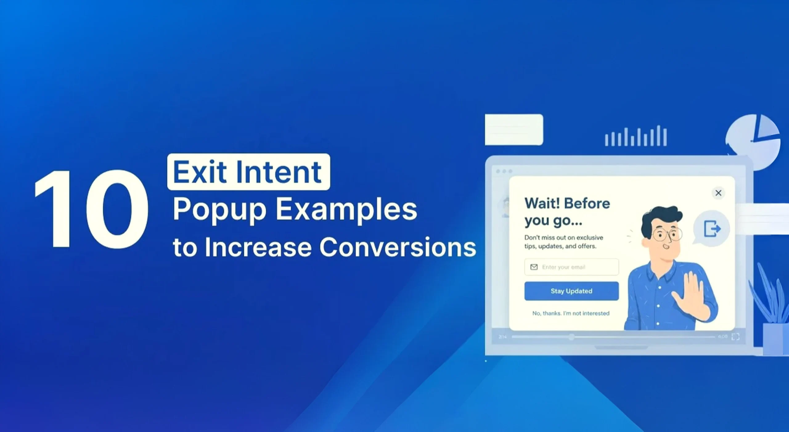
An exit intent popup is one of the few tools that gives you a second chance right at the moment someone is about to click away. It detects when a visitor’s mouse moves toward the browser’s close button or address bar, and it triggers a targeted message before they’re gone for good.
The tricky part is that not every exit intent popup works. Some annoy visitors and get closed instantly. Others convert at rates that genuinely surprise store owners. The difference usually comes down to the offer, the timing, and how the popup is written.
Below are ten exit intent popup examples we’ve seen work well across WooCommerce stores, SaaS sites, blogs, and service businesses, along with why each one performs and how to set it up on your own WordPress site.
- 1. The First Purchase Discount Popup
- 2. The Cart Abandonment Recovery Popup
- 3. The Newsletter Signup Popup
- 4. The Limited-Time Offer Popup
- 5. The Lead Magnet Popup
- 6. The Exit Intent Quiz Popup
- 7. The Free Trial Popup
- 8. The Feedback Survey Popup
- 9. The Webinar Registration Popup
- 10. The Personalized Recommendation Popup
- Best Practices for Exit Intent Popups That Actually Work
- Mistakes That Quietly Kill Popup Performance
- How to Set Up Exit Intent Popups on WordPress
- Final Thoughts
- Frequently Asked Questions
What Actually Makes an Exit Intent Popup Convert?
Before jumping into the examples, it helps to understand what separates a popup people ignore from one that actually gets clicked.
A few things matter more than the rest:
- Relevance. A discount on shoes means nothing to someone reading a blog post about running shoe sizing.
- Timing. Trigger too early and it feels like spam. Trigger too late and the visitor’s already closed the tab.
- Simplicity. One clear offer and one clear action beats a popup crammed with three CTAs and a paragraph of text.
- A reason to act now. Urgency, scarcity, or a genuinely good deal moves people faster than a generic “subscribe to our newsletter” ask ever will.
Keep those four in mind as you go through the examples, because they show up again and again.
1. The First Purchase Discount Popup
This is the most widely used exit intent popup, and for good reason. It’s simple: offer a small discount to visitors who haven’t bought from you yet.
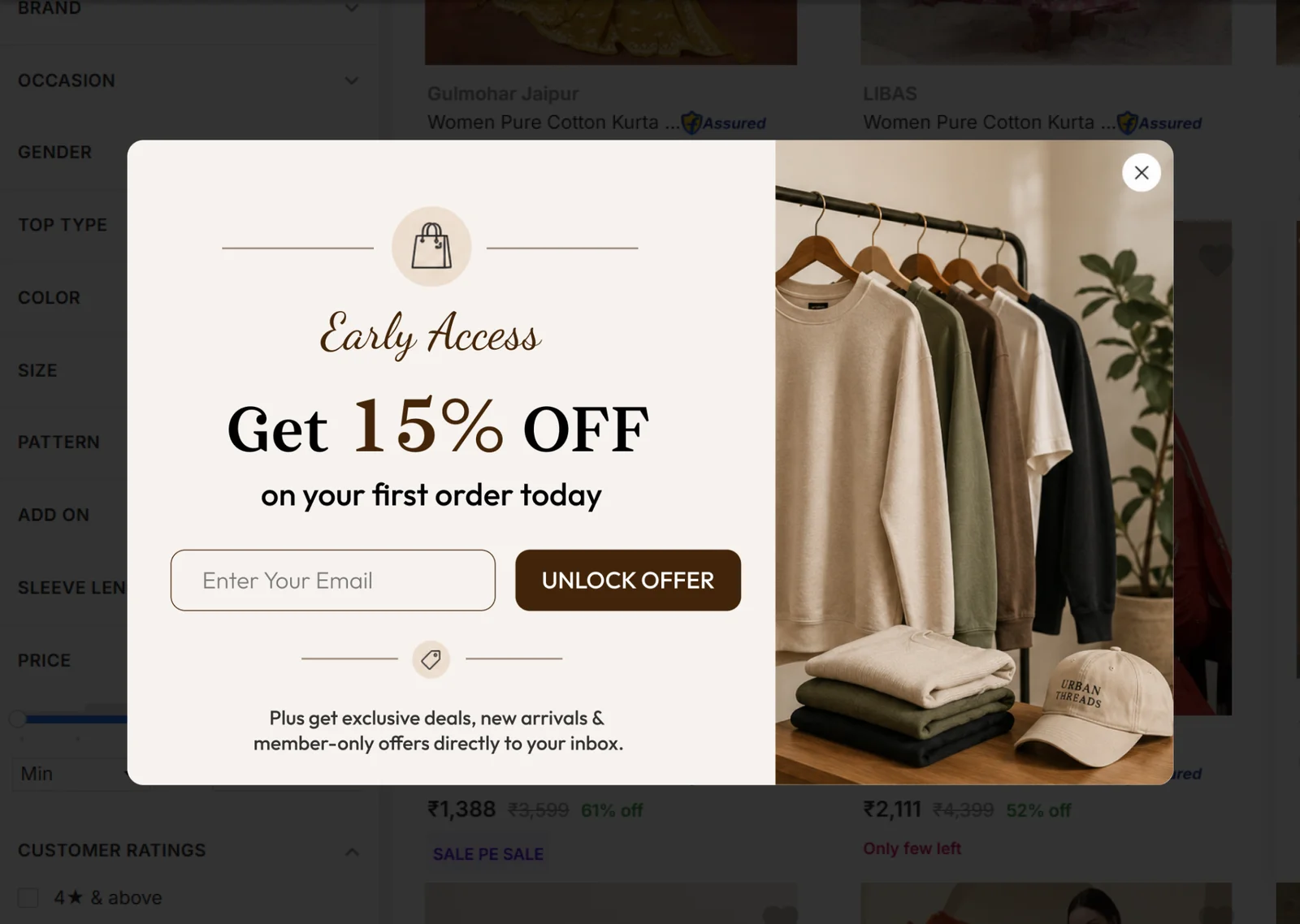
Example headline: “Wait, here’s 10% off your first order.”
Works well for: WooCommerce stores, fashion and beauty brands, D2C shops, and pretty much any ecommerce site selling to first-time buyers.
Why it works: A lot of visitors who reach checkout or browse products are on the fence, not against buying, just not fully convinced yet. A modest discount is often enough to tip that decision in your favor.
Tips that make it perform better:
- Show the discount code clearly, don’t bury it
- Use one CTA button, not two competing ones
- Ask for an email address only, skip extra form fields
- Add a short expiry window if you want a bit more urgency
2. The Cart Abandonment Recovery Popup
Cart abandonment is the single biggest revenue leak for most online stores. Visitors add items, get to checkout, and then something interrupts them, a distraction, a shipping cost surprise, a moment of hesitation, and they leave.
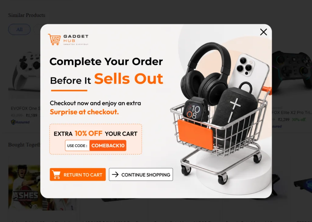
Example headline: “Your cart is waiting. Complete your order and get free shipping.”
Works well for: checkout pages, cart pages, and product pages on WooCommerce sites.
Why it works: Someone who’s already added a product to their cart has shown real purchase intent. They’re much closer to buying than a random visitor, so a small nudge, free shipping, a discount, or even a reminder, can be enough to get them back.
Tips that make it perform better:
- Free shipping tends to outperform percentage discounts for cart recovery
- Show the actual product or cart total in the popup if you can
- Keep the message short, this isn’t the place for long copy
3. The Newsletter Signup Popup
Not every visitor is ready to buy the moment they land on your site. Some just want to browse, read, or think it over. A newsletter popup lets you keep the relationship going instead of losing the visitor completely.
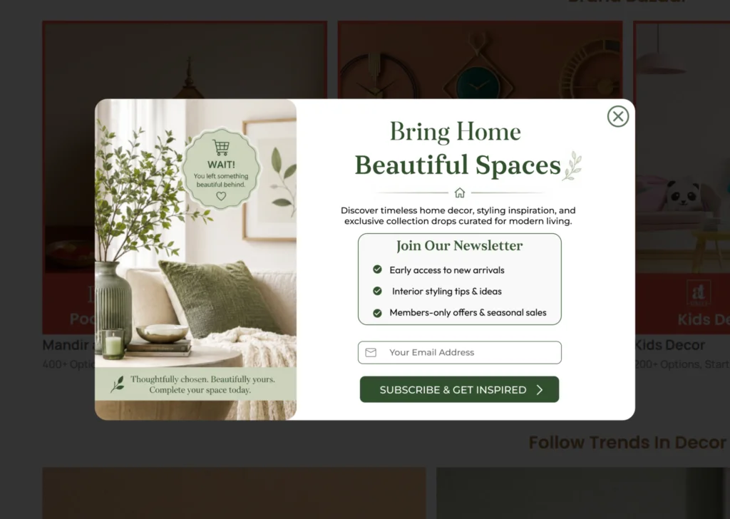
Example headline: “Get early access to deals before anyone else.”
Works well for: blogs, SaaS websites, content sites, and agencies.
Why it works: Even if someone doesn’t buy today, capturing their email means you can follow up later through email marketing. That turns a one-time visit into a long-term lead.
Tips that make it perform better:
- Skip generic phrases like “subscribe to our newsletter,” they rarely convert
- Give a specific reason to sign up (deals, tips, updates)
- Keep the form to one field whenever possible
4. The Limited-Time Offer Popup
Urgency works. When people believe an offer is disappearing soon, they’re far more likely to act instead of putting it off.
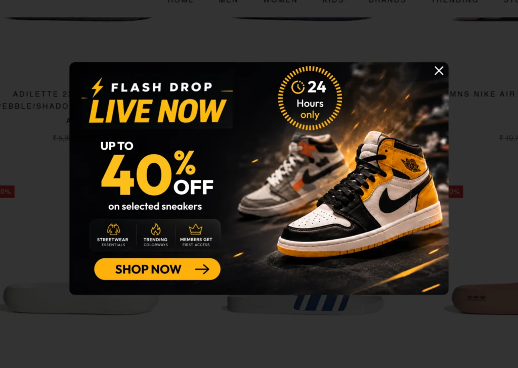
Example headline: “This offer ends tonight.”
Works well for: seasonal sales, product launches, Black Friday and holiday campaigns.
Why it works: Fear of missing out is a real psychological trigger, but it only works if the urgency is genuine. Fake countdown timers that reset every time someone visits will eventually damage trust.
Tips that make it perform better:
- Use a real countdown timer tied to an actual deadline
- Be honest about when the offer ends
- Pair urgency with a clear, specific benefit
5. The Lead Magnet Popup
If you’re not selling a physical product, a free resource can be just as effective as a discount at getting someone to hand over their email.
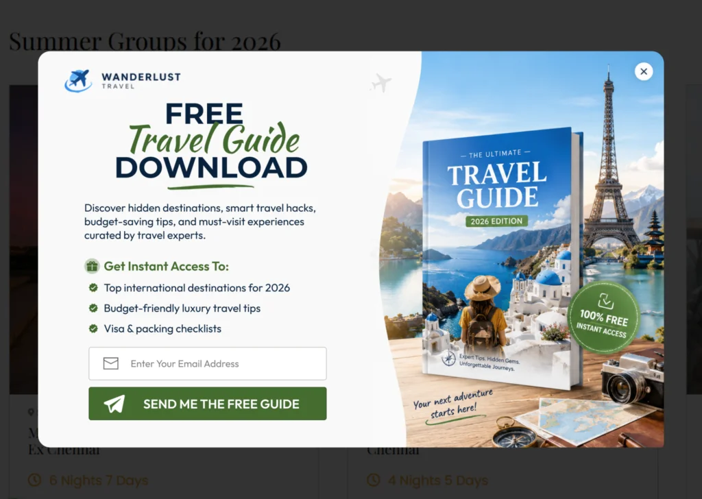
Example headline: “Download the free guide to growing your online store.”
Works well for: SaaS companies, agencies, consultants, and educational sites.
Why it works: People are more willing to share their contact details when they’re getting something useful in return, not just a vague promise of updates.
Tips that make it perform better:
- Make sure the resource actually matches what the page is about
- Use a real title for the resource, not just “free guide”
- Keep the popup design clean so the offer stands out
6. The Exit Intent Quiz Popup
Static popups ask visitors to do something. Interactive popups ask visitors to engage first, which tends to hold attention longer.
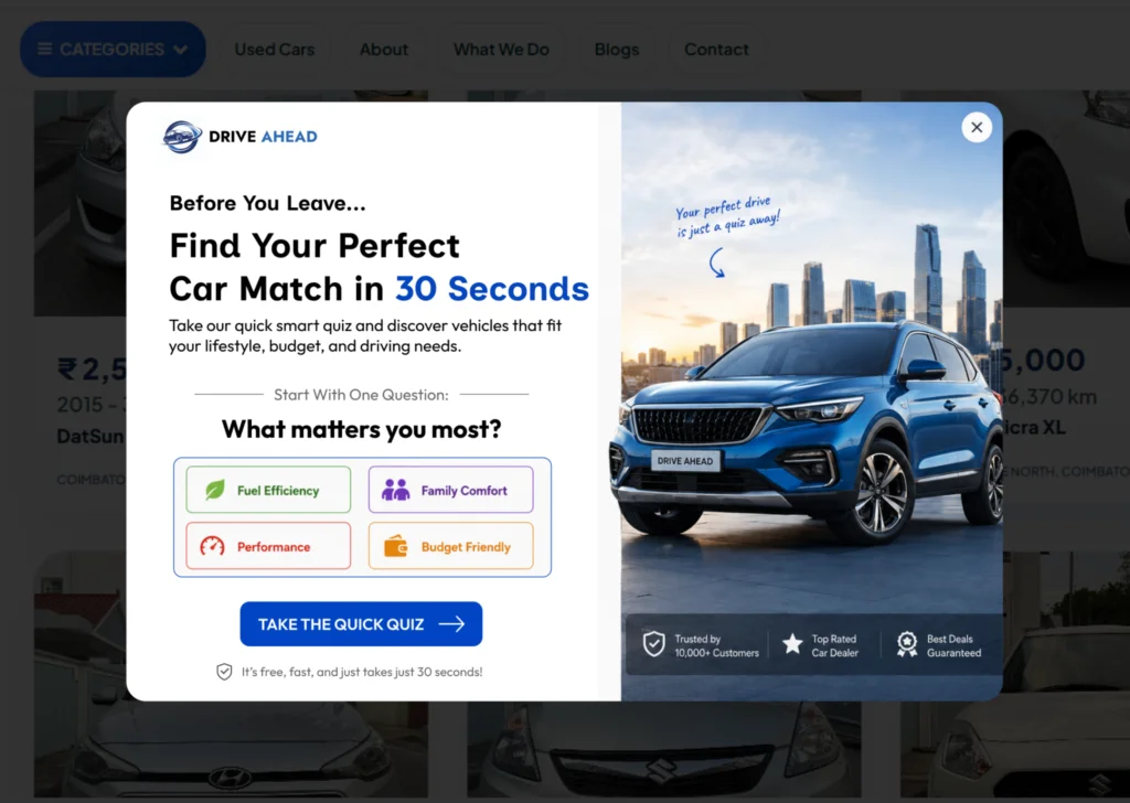
Example headline: “Not sure which product is right for you? Find out in 30 seconds.”
Works well for: beauty and skincare brands, fitness sites, SaaS platforms, and any store where product fit varies by customer.
Why it works: A short quiz feels more like a helpful tool than an advertisement. It also gives you useful data about what visitors are looking for.
Tips that make it perform better:
- Keep it to three or four questions at most
- Show a personalized result, not a generic one
- Use the quiz answers to recommend a specific product, not your whole catalog
7. The Free Trial Popup
For SaaS businesses, the biggest hesitation isn’t usually price, it’s uncertainty about whether the product actually works for their situation. A free trial removes that risk.
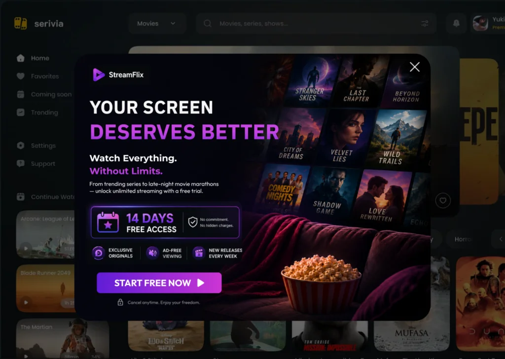
Example headline: “Try it free for 14 days, no card required.”
Works well for: SaaS products, subscription tools, and software platforms.
Why it works: Letting someone experience the product firsthand does more to convince them than any amount of marketing copy.
Tips that make it perform better:
- If you don’t require a credit card, say so directly, it removes a major objection
- Keep the signup form to essentials only
- Mention what happens after the trial ends so there’s no surprise later
8. The Feedback Survey Popup
Sometimes the goal isn’t a conversion at all, it’s information. Understanding why visitors are leaving can be more valuable long term than a single sale.
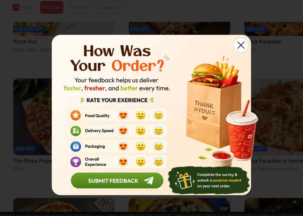
Example headline: “What stopped you from completing your order today?”
Works well for: WooCommerce checkout pages and any site trying to fix a conversion problem.
Why it works: Direct feedback often reveals issues you wouldn’t catch through analytics alone, confusing pricing, unexpected shipping costs, or a checkout step that’s too long.
Tips that make it perform better:
- Use multiple choice answers so it takes seconds to complete
- Keep it to one question if you can
- Actually review and act on the responses, this only helps if you use the data
9. The Webinar Registration Popup
For businesses built around education, coaching, or high-consideration sales, webinars are a strong lead generation tool, and exit intent is a good moment to promote one.
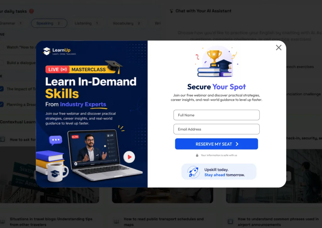
Example headline: “Seats are limited, save your spot before registration closes.”
Works well for: coaches, agencies, SaaS companies, and online course creators.
Why it works: A webinar gives visitors a low-commitment way to learn more before buying, which works well for products or services that need more explanation than a product page can offer.
Tips that make it perform better:
- Mention the specific topic, not just “join our webinar”
- Include the date and time up front
- If spots are genuinely limited, say so, if not, don’t fake scarcity
10. The Personalized Recommendation Popup
Generic popups get ignored. Personalized ones tend to get clicked, because they feel relevant to what the visitor was already doing.
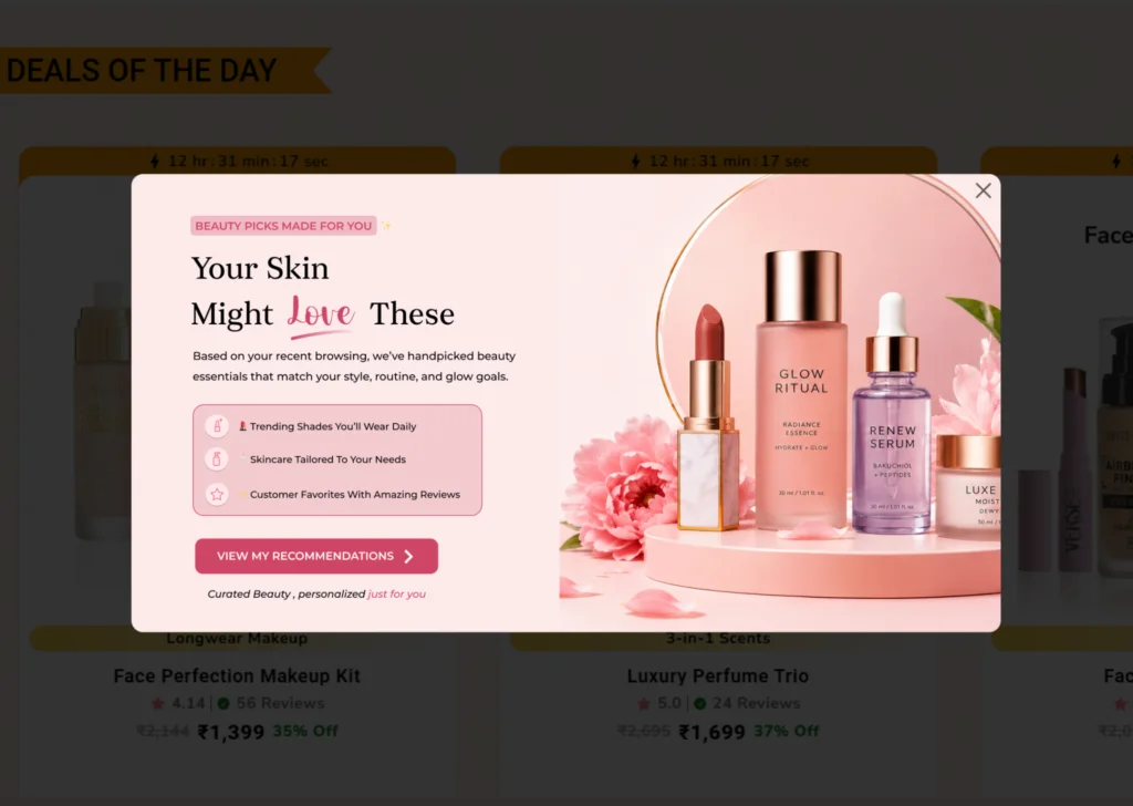
Example headline: “Since you were looking at this, you might also like these.”
Works well for: WooCommerce stores, fashion retailers, and electronics sites with larger catalogs.
Why it works: Recommendations based on actual browsing behavior feel less like advertising and more like helpful suggestions, which tends to increase both trust and click through rates.
Tips that make it perform better:
- Base recommendations on real browsing or cart data, not random products
- Limit it to two or three suggestions, not a full grid
- Keep the design simple so the products are the focus
Best Practices for Exit Intent Popups That Actually Work
Even a good idea can fall flat without the right execution. A few things worth paying attention to across every popup you run.
Lead with a real offer. Discounts, free shipping, useful resources, or free trials all give visitors an actual reason to stop and read.
Keep the design simple. One headline, one offer, one button. The more cluttered a popup looks, the faster people close it.
Test on mobile. A popup that looks great on desktop can be completely broken on a phone screen. Always check both before launching.
Use targeting instead of showing the same popup everywhere. A cart recovery popup belongs on checkout pages. A newsletter popup fits better on blog content. Matching the popup to the page increases relevance.
Don’t overdo frequency. Showing the same popup every single visit gets old fast. Most tools let you limit display frequency per session or hide the popup after someone converts.
Test and adjust over time. Headlines, offers, and even button colors can make a noticeable difference. Running small tests over a few weeks usually tells you more than guessing ever will.
Mistakes That Quietly Kill Popup Performance
A handful of mistakes show up again and again on underperforming popups.
Weak, generic offers are one of the biggest. “Subscribe to our newsletter” rarely convinces anyone on its own, there’s no clear benefit attached.
Overloaded popups are another. Too much text, multiple offers, or several buttons make visitors hesitate instead of act.
Ignoring mobile visitors is a mistake that’s easy to overlook but costly, since a large share of traffic on most sites now comes from phones.
Showing the identical popup to every visitor regardless of the page they’re on wastes an opportunity for relevance.
And finally, never testing or reviewing performance means you’re likely leaving conversions on the table without even knowing it.
How to Set Up Exit Intent Popups on WordPress
You don’t need to know how to code to add exit intent popups to a WordPress or WooCommerce site. Plugins like YS LeadGen handle the technical side, detecting exit intent, displaying the popup, and tracking results, so you can focus on the offer and the messaging.
With a plugin like this, you’re typically able to:
- Choose from pre-built popup templates
- Customize the design to match your brand
- Set exit intent as the trigger condition
- Add targeting rules based on page, device, or visitor behavior
- Track conversions and adjust campaigns as you go
This makes it realistic for store owners and marketers to launch a proper exit intent strategy without hiring a developer.
Final Thoughts
Exit intent popups aren’t a gimmick, they’re a practical way to make the most of traffic you’ve already earned. Whether the goal is recovering abandoned carts, growing an email list, generating leads, or just understanding why visitors leave, the right popup at the right moment can make a real difference in your numbers.
The examples above cover most of the situations a WordPress or WooCommerce site will run into. Start with one or two that fit your business best, test them for a few weeks, and refine from there based on what the data actually shows.
Frequently Asked Questions
An exit intent popup is a popup that appears when a visitor is about to leave a webpage, usually detected by their mouse movement toward the browser’s close button or address bar. It gives site owners one more chance to capture attention before the visitor leaves.
Yes, when they’re relevant and well timed. They’re commonly used to recover abandoning visitors, reduce cart abandonment, grow email lists, and generate leads. Results vary by industry and offer, but well-targeted popups consistently outperform generic ones.
Not when they’re implemented correctly. Google has specifically called out intrusive interstitials that block content, especially on mobile, as a ranking factor. An exit intent popup that appears as someone is leaving, rather than immediately on page load, generally doesn’t cause SEO issues.
It depends on your business and the page it’s shown on. Discount popups and cart recovery popups tend to perform best on ecommerce sites, while lead magnet and newsletter popups typically work better on blogs and content sites.
Yes. Plugins such as YS LeadGen let you build and launch exit intent popups through a visual editor, no development work required.
Exit intent, in the traditional sense of tracking mouse movement toward the browser edge, doesn’t apply the same way on mobile since there’s no cursor. Good popup plugins use alternative triggers on mobile, like scroll behavior or time on page, and support responsive designs across screen sizes.
YS LeadGen is a popular choice for WordPress and WooCommerce sites, offering exit intent triggers, popup templates, and targeting options aimed at beginners and small business owners.
About the author

YSLeadGen Pro - Lifetime Deal
Access to unlimited popups, advanced targeting, event triggers, and premium templates.
14-Days Risk Free Money Back Guarantee