- Category 2: Form Design and Mobile UX Mistakes
- Category 3: Timing and Display Rule Mistakes
- Category 4: Testing and Validation Mistakes
- Category 5: Onboarding and Privacy Mistakes
- Understanding Lead Magnets: What Gifts Actually Work?
- Writing Clear, High-Converting Copy for Your Forms
- Setting Up an Automated Welcome Sequence
- Essential Email List Hygiene Practices
- Easy Technical Checklist for Website Speed and SEO
- Using YS LeadGen on WordPress
- Quick Action Summary: 4 Steps to Improve Your Forms Today
- Final Thoughts
- Frequently Asked Questions
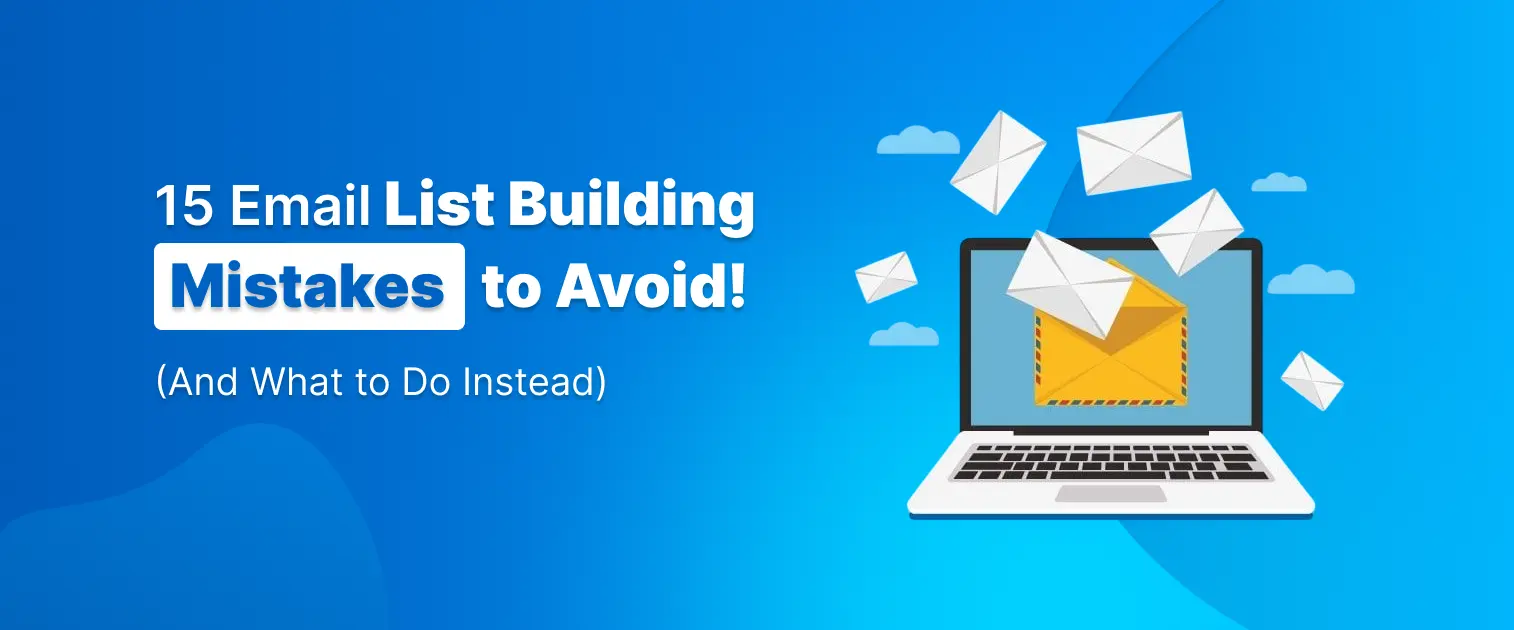
15 Simple Email List Building Mistakes to Avoid (And Easy Fixes)

- Category 2: Form Design and Mobile UX Mistakes
- Category 3: Timing and Display Rule Mistakes
- Category 4: Testing and Validation Mistakes
- Category 5: Onboarding and Privacy Mistakes
- Understanding Lead Magnets: What Gifts Actually Work?
- Writing Clear, High-Converting Copy for Your Forms
- Setting Up an Automated Welcome Sequence
- Essential Email List Hygiene Practices
- Easy Technical Checklist for Website Speed and SEO
- Using YS LeadGen on WordPress
- Quick Action Summary: 4 Steps to Improve Your Forms Today
- Final Thoughts
- Frequently Asked Questions
An email list is the best tool for any website owner, business owner, or content creator who wants to grow a loyal audience. Social media apps change their rules and algorithms all the time. When that happens, your posts can suddenly reach far fewer people. On the other hand, your email list gives you a direct way to talk to people who chose to hear from you. You own this list completely, which makes it a safe and reliable way to bring people back to your website and make more sales.
However, getting visitors to sign up for your email list is not always easy. Many website owners lose subscribers without knowing it. They might use large popups that block the screen, slow down their site with heavy tools, or ask for too much personal details. When a signup form is annoying or hard to use, visitors quickly leave the page. Growing your email list does not require pushy sales tricks. You simply need clear words, useful free gifts, fast-loading forms, and smart timing.
This guide explains 15 common email list-building mistakes in very simple, easy-to-read language. You will learn practical ways to fix each problem, keep your website fast, improve your signups, and build a great system on WordPress using simple tools like YS LeadGen.
Category 1: Strategy and Offer Mistakes
Understanding What Your Visitor Wants
Before you create a signup form, think carefully about what your visitors actually want. People protect their email inboxes very carefully. They will only give you their email address if you offer them something really useful in return. If your offer is boring, generic, or unhelpful, visitors will close the form right away.
1. Focus on Quality, Not Just Quantity
- The Mistake: Buying email lists from stranger websites or giving away random prizes—like a cheap tablet or cash gift card—just to get lots of email signups fast. This brings in people who only want free prizes. They will never open your emails, and they might mark your messages as spam, which hurts your reputation.
- What to Do Instead: Focus only on getting real, interested subscribers who truly care about your business topic. Offer helpful resources that solve a real problem for your exact audience.
- Simple Example: Instead of offering a random $100 cash prize, give away a free 1-page PDF checklist, a short tutorial video, or a practical template that only your actual customers would want to download.
2. Using Weak Button Text
- The Mistake: Using boring, standard words on your form buttons, like “Submit,” “Click Here,” “Register,” or “Subscribe.” These generic words fail to remind visitors about the nice reward they are about to get.
- What to Do Instead: Write clear, active button text that explains the exact benefit. Use simple, direct phrases like “Get My Free Checklist,” “Claim My 15% Discount,” or “Start Learning Today.”
- Simple Example: Change your plain “Subscribe” button to “Send Me the Free Guide.” This simple change clearly reminds visitors what they will receive as soon as they click.
3. Offering Unrelated Free Gifts
- The Mistake: Creating one generic free gift—like a broad 50-page ebook—and showing it on every single page of your site, no matter what topic the visitor is reading about.
- What to Do Instead: Match your free gift directly to the topic of the specific page. When your free offer matches what the reader is already interested in, far more people will sign up.
- Simple Example: If a visitor is reading an article about quick dinner recipes, offer them a printable 7-day dinner planner—not a general guide on how to organize a garage.
Category 2: Form Design and Mobile UX Mistakes
Making Forms Easy to Use for Everyone
Your signup forms must look clean and work well on all devices, especially mobile phones. Complex form layouts, too many words, or missing close buttons frustrate visitors quickly.
4. Asking for Too Much Information
- The Mistake: Forcing new visitors to fill out long forms that ask for their full name, phone number, company name, and home address just to download a simple PDF or join a weekly newsletter. Long forms take too much time and scare people away.
- What to Do Instead: Ask for the minimum details needed to deliver your gift. In most cases, asking for just an email address—or an email address and a first name—is more than enough.
- Simple Example: Look at your forms today and remove fields like “Phone Number” or “Company Name.” Keeping your forms short and quick makes many more people fill them out.
5. Forgetting About Mobile Phones
- The Mistake: Showing large popups designed for computer screens that completely block phone screens, hide the article text, or push the close button (“X”) off the screen where phone users cannot tap it.
- What to Do Instead: Use mobile-friendly form layouts. Make sure the close button is big, clear, and easy to tap with a thumb without needing to zoom in or scroll sideways.
- Simple Example: Open your website on your own smartphone and test every form. Make sure the close button is large enough to tap easily without accidentally clicking an ad.
6. Using Heavy, Slow-Loading Scripts
- The Mistake: Using poorly made or heavy form plugins that run large code files. This makes your whole website load slowly, causes text to jump around on the screen, and makes visitors leave before reading your page.
- What to Do Instead: Choose lightweight, fast lead capture tools that load quietly in the background without slowing down your main page text.
- Simple Example: Set your forms to load asynchronously so that your main website text and images show up instantly while form tools load smoothly in the background.
Category 3: Timing and Display Rule Mistakes
Showing Offers at the Right Moment
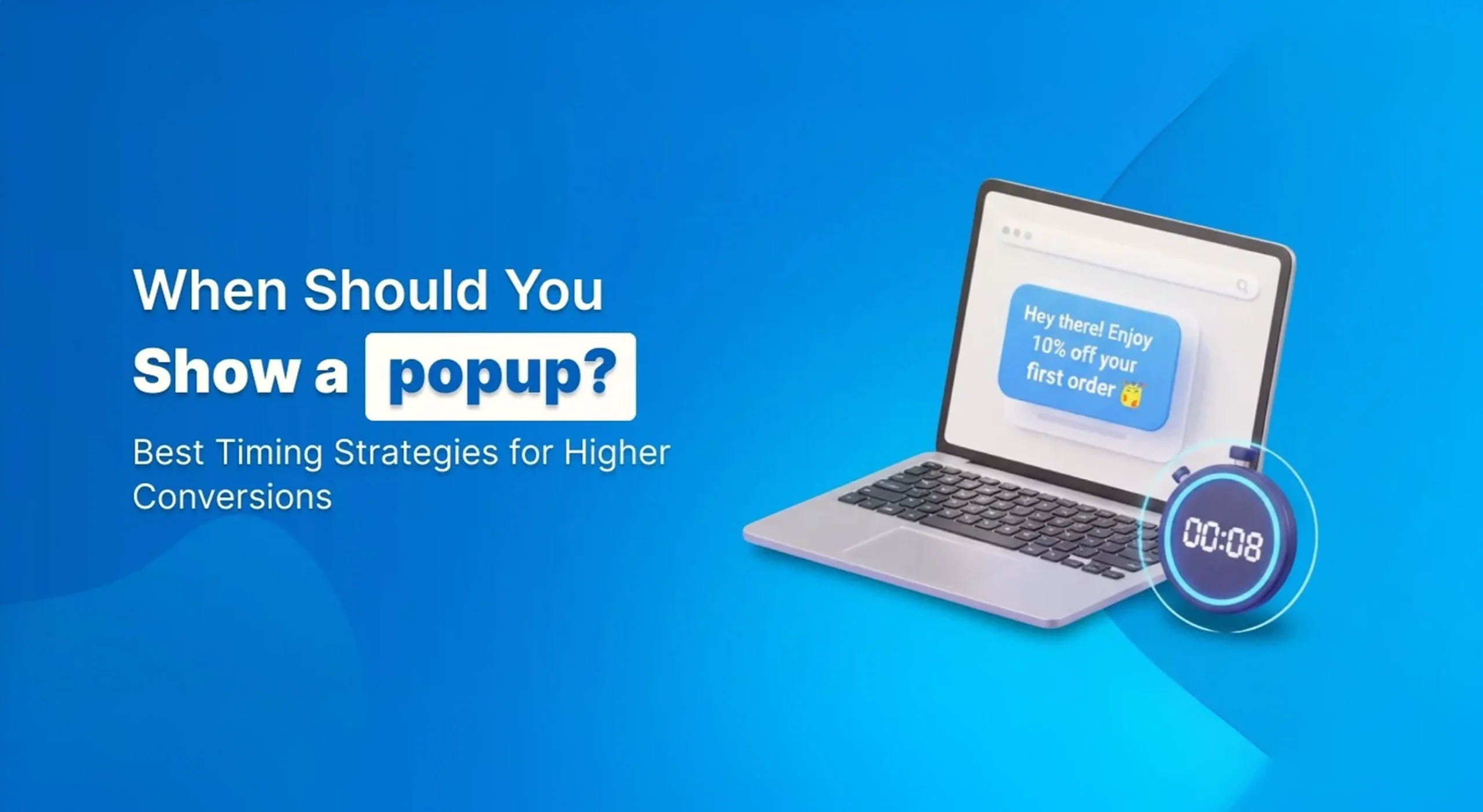
Timing is very important for getting people to sign up. Showing a popup the very second someone lands on your page is annoying, but showing a helpful offer after they have read your content works much better.
7. Showing Popups Immediately
- The Mistake: Opening a full-screen popup the exact millisecond a visitor arrives on your web page. Interrupting readers before they read a single sentence frustrates them and makes them leave your site instantly.
- What to Do Instead: Use smart timing rules. Wait until the visitor has spent 15 to 30 seconds on your page, or until they have scrolled down through half of your article.
- Simple Example: Change your popup settings so forms only show up after a reader has spent at least 20 seconds exploring your page, giving them time to see that your content is good.
8. Missing People Who Are About to Leave
- The Mistake: Letting interested visitors close your website without giving them one final, friendly chance to stay connected or get a handy summary guide.
- What to Do Instead: Use exit-intent technology on desktop computers. This smart feature notices when a user’s mouse moves up toward the close button or address bar, and displays a helpful offer right before they leave.
- Simple Example: Show a friendly popup right as someone goes to exit, saying: “Before you go, take our 1-page summary checklist with you for free!”
9. Showing the Same Form to Everyone
- The Mistake: Showing the exact same popup over and over again to every visitor, even after they have already joined your list or closed the popup multiple times.
- What to Do Instead: Use smart cookies or local storage settings to hide signup forms from existing subscribers, and stop showing closed popups to returning visitors for a few weeks.
- Simple Example: Set your form rules so that once a visitor closes a popup, that form stays hidden from them for at least 30 days so you do not annoy your regular readers.
Category 4: Testing and Validation Mistakes
Improving Forms Using Real Data
Building a great email list requires simple checkups. Regularly checking that email addresses are real and testing different design options helps your forms get better results over time.
10. Allowing Fake or Incorrect Email Addresses
- The Mistake: Accepting signups without checking for simple typos (such as name@gmal.com or user@yaho.com) or fake addresses created by computer bots. Accumulating fake emails hurts your ability to reach real inboxes.
- What to Do Instead: Use real-time email checking tools or double opt-in setups, where new subscribers must click a confirmation link sent to their email inbox before getting their download.
- Simple Example: Turn on double opt-in confirmation for your free downloads. This makes sure every single email address on your list belongs to a real person who wants your emails.
11. Never Checking Form Stats
- The Mistake: Putting a signup form on your website and never checking how many people see it compared to how many actually fill it out, missing easy ways to get more subscribers.
- What to Do Instead: Check your form numbers once a month. Compare how many views a form gets against how many signups it earns to see which forms need improvement.
- Simple Example: Check your form numbers regularly. If 1,000 people view a form but only 10 people sign up, try changing the headline or changing the button color to see if signups go up.
12. Guessing Instead of Testing
- The Mistake: Picking form colors, background images, headlines, and button words based only on what you personally like, instead of testing what your readers actually respond to.
- What to Do Instead: Run simple A/B split tests to compare two different versions of a form. Change just one thing—like the main headline—and see which version gets more signups.
- Simple Example: Run a test comparing a short headline (“Get Weekly Marketing Tips”) against a benefit headline (“Learn How to Double Your Traffic in 10 Minutes a Week”).
Category 5: Onboarding and Privacy Mistakes
Building Trust with New Subscribers
Getting an email address is only the first step. How you welcome new contacts, protect their privacy, and keep your list clean determines whether they stay with you for a long time.
13. Waiting Too Long to Send the First Email
- The Mistake: Collecting a new reader’s email address but waiting several days or weeks to send them your first email. By the time your email arrives, the person has forgotten who you are and might mark your message as spam.
- What to Do Instead: Set up an automatic welcome email that sends instantly when someone signs up. This delivers their promised gift right away and introduces your brand properly.
- Simple Example: Set your email tool to automatically send a welcome message within 60 seconds of signup with their free download link, followed by a helpful tip 24 hours later.
14. Keeping Inactive Subscribers Forever
- The Mistake: Keeping thousands of old, inactive email addresses on your list for years just to show off a large total subscriber count. People who never open your emails hurt your open rates and make email providers like Gmail send your messages to the spam folder.
- What to Do Instead: Clean your email list every 3 to 6 months. Send a quick re-engagement email to inactive readers, and remove anyone who stays completely unresponsive.
- Simple Example: Find subscribers who have not opened an email from you in the last 90 days. Send them a simple message asking “Do you still want our emails?”, and unsubscribe anyone who does not answer.
15. Hiding the Unsubscribe Link
- The Mistake: Making it hard for people to leave your list, using tiny font sizes, or hiding the unsubscribe link inside complicated footers. Frustrated readers will press the “Report Spam” button instead.
- What to Do Instead: Place a clean, easy-to-see 1-click unsubscribe link at the bottom of every email you send so people can leave easily whenever they want.
- Simple Example: Keep the text at the bottom of your emails clear and easy to read, giving subscribers full confidence that they can safely leave the list anytime with one simple click.
Understanding Lead Magnets: What Gifts Actually Work?
A lead magnet is a free gift you give website visitors when they share their email address with you. Choosing the right kind of free gift is super important. If your free gift takes hours to read or complete, people will set it aside and forget all about it. If it offers instant, easy help, they will trust you right away.
Characteristics of High-Converting Free Gifts
- Quick to Use: The best free gifts can be read or used in less than 5 minutes. Simple checklists, 1-page cheatsheets, and practical templates work much better than long 50-page ebooks.
- Solves One Specific Problem: Do not try to explain everything all at once. Focus on solving just one clear, simple problem that your customer is dealing with today.
- Provides Immediate Help: Give an instant answer or solution that your subscriber can put to work right away without needing extra tools or complicated steps.
Comparison of Popular Lead Magnet Formats
| Gift Format | Best For | Average Signups | Time Needed to Create |
| Checklist / Cheatsheet | Quick step-by-step actions | High (8% – 12%) | Very Low (1–2 hours) |
| Resource List / Tool Kit | Sharing recommended tools or links | High (7% – 10%) | Low (2–3 hours) |
| Discount Code / Coupon | Online stores and shopping sites | Highest (10% – 15%) | Instant |
| PDF Guide / Mini Ebook | Explaining larger learning topics | Medium (3% – 5%) | High (10+ hours) |
| Video Training Lesson | Showing technical tasks step-by-step | High (6% – 9%) | Medium (4–6 hours) |
Writing Clear, High-Converting Copy for Your Forms
The exact words you write on your signup forms have a big impact on how many people join your list. Most website readers quickly scan pages instead of reading every word carefully. Use simple, clear, direct words that highlight the benefits instead of fancy corporate talk.
The 3-Part Headline Formula
Every great signup form should use a simple 3-part layout structure:
- The Main Headline: State the primary reward or benefit in plain, easy words. Focus on the good result the reader gets or the problem they avoid.
- The Subheadline: Briefly describe what is included inside the free download and how quickly they can use it.
- The Call-to-Action (CTA) Button: Use clear first-person words describing the action (for example: “Send Me My Free Guide” instead of “Submit”).
Before & After Copy Examples
- Weak Copy: “Subscribe to our monthly newsletter for news, updates, and announcements.”
- Strong Copy: “Get 5 Short Marketing Tips Every Monday. Read in under 3 minutes.”
- Weak Copy: “Download our complete business guide today.”
- Strong Copy: “Get the Free 1-Page WordPress Speed Checklist. Make your site load faster in 10 minutes.”
Setting Up an Automated Welcome Sequence
Collecting an email address is only the first step of the journey. Taking good care of your new subscribers helps turn casual readers into regular buyers. An automatic welcome email series ensures every new subscriber feels welcomed, appreciated, and helped right from day one.
The 3-Step Welcome Email Framework
- Email 1 (Sent Immediately): The Delivery & Welcome: Send your promised free gift instantly. Keep the message short, thank the reader for joining, and clearly tell them what helpful topics you will email them about in the future.
- Email 2 (Sent 24–48 Hours Later): The Useful Tip: Share your best blog post, a super helpful tip, or a short story about why you started your website. Focus on showing how helpful you can be.
- Email 3 (Sent 3–4 Days Later): The Soft Invitation: Point your subscribers to your main services, best products, or resource page. Ask them to click “Reply” and share their biggest struggle with you.
Essential Email List Hygiene Practices
Cleaning your email database on a regular schedule keeps your list healthy and protects your sender reputation. When email services (like Gmail, Outlook, or Yahoo) notice that many of your recipients do not open your messages, they start sending your emails straight to the spam folder.
Key Hygiene Metrics to Watch:
- Open Rate: The percentage of people who open your email. A good open rate is usually between 20% and 35%.
- Bounce Rate: The percentage of sent emails that could not be delivered because of fake or dead addresses. Keep this number below 2% by checking emails.
- Unsubscribe Rate: The percentage of people who leave your list after receiving an email. A normal rate stays well below 0.5%.
Easy Technical Checklist for Website Speed and SEO
How your signup forms work behind the scenes directly influences your search engine rankings and website performance numbers:
- Keep Visual Layouts Stable: Popups and banner forms should show up smoothly without causing the main article text or photos to jump around suddenly on the screen while loading.
- Protect Website Speed: Use lightweight, fast form code so your website opens quickly, even on slow phone internet connections.
- Follow Mobile Reading Standards: Avoid large, annoying popups that completely cover the main article text the moment a mobile visitor opens your web page.
Using YS LeadGen on WordPress
Managing display rules, mobile designs, and signup forms on WordPress is simple when you use dedicated, fast tools like YS LeadGen. It allows you to create clean, mobile-ready forms without writing code or using slow external software.
| Key Feature | What It Does | Why It Helps |
| Simple Visual Builder | Design popups, slide-ins, and banner forms visually | No technical coding needed |
| Smart Display Rules | Show forms after scrolling, time delays, or exit intent | Keeps visitors happy and relaxed |
| Lightweight Performance | Loads form code quietly in the background | Protects site speed and page load numbers |
| Mobile-First Layouts | Form designs adjust automatically to smartphone screens | Delivers a great experience on all devices |
| Built-in Analytics | Tracks views, signups, and conversion numbers inside WordPress | Makes monitoring performance super easy |
Quick Action Summary: 4 Steps to Improve Your Forms Today
- Test Your Forms on a Mobile Phone: Open your website on a smartphone and test every form. Check that text is easy to read, input boxes are clear, and the close button is simple to tap.
- Remove Unnecessary Form Fields: Keep your signup forms short and easy by asking only for an email address and a first name.
- Set Up Smart Display Rules: Replace instant popups with a 15-to-20 second time delay, a 50% scroll threshold, or exit-intent triggers.
- Automate Instant Email Delivery: Make sure your email marketing software sends promised free gifts within seconds of form submission.
Final Thoughts
Growing a healthy, active email list does not require pushy sales tactics, confusing marketing tricks, or annoying full-screen popups. Real email growth happens when you respect your visitors’ time, protect their mobile reading experience, and offer clear, genuine value in exchange for their attention. Every subscriber on your list is a real person looking for helpful answers, so making your website easy and enjoyable to use builds strong long-term trust.
Take some time today to review your current signup forms step by step. Focus on removing unnecessary input fields, delaying aggressive popup timing, keeping page load speeds fast, and sending quick welcome emails. By pairing simple words with lightweight, reliable tools like YS LeadGen on WordPress, you can easily set up your lead capture system, keep your website running fast, and steadily build an active community of loyal subscribers for years to come.
Frequently Asked Questions
What Is the Biggest Email List Building Mistake?
One of the most common mistakes is failing to provide a compelling reason to subscribe.
Visitors need a clear benefit before they'll share their email address.
Do Popups Help Grow Email Lists?
Yes.
When used strategically, popups can significantly increase subscriber growth by engaging visitors at key moments during their website journey.
How Many Fields Should a Signup Form Have?
In most cases, fewer fields generate higher conversion rates.
Many businesses successfully collect only an email address or an email address and first name.
What Is a Good Email Signup Conversion Rate?
Conversion rates vary by industry and traffic source. However, improving your current performance is generally more important than comparing yourself to industry averages.
Should I Use Lead Magnets?
Absolutely.
Lead magnets provide immediate value and often generate significantly more subscribers than generic newsletter signup forms.
About the author

YSLeadGen Pro - Lifetime Deal
Access to unlimited popups, advanced targeting, event triggers, and premium templates.
14-Days Risk Free Money Back Guarantee