There’s a reason full screen popups tend to get a stronger reaction than smaller ones, and it isn’t just size. When an overlay takes up the entire screen, there’s nothing left to look at except the message you’ve written and the button underneath it. No sidebar, no navigation menu, no half finished article competing for attention. That focus is exactly what makes the format so effective, and also exactly why it can go wrong quickly if it’s used carelessly.
A full screen popup, sometimes called a welcome mat because of how it greets new visitors, is one of the more direct tools available on a WordPress site. It doesn’t ask for attention politely from a corner of the screen. It takes over the whole browser window for a moment and asks the visitor to make a decision: engage, or close it and move on.
This guide covers what a full screen popup actually is, how it differs from smaller popup formats, when it makes sense to use one, and the full process for building one in WordPress using YS LeadGen. It also covers the design and timing decisions that separate a full screen popup people actually respond to from one that just gets closed on reflex.
What Is a Full Screen Popup?
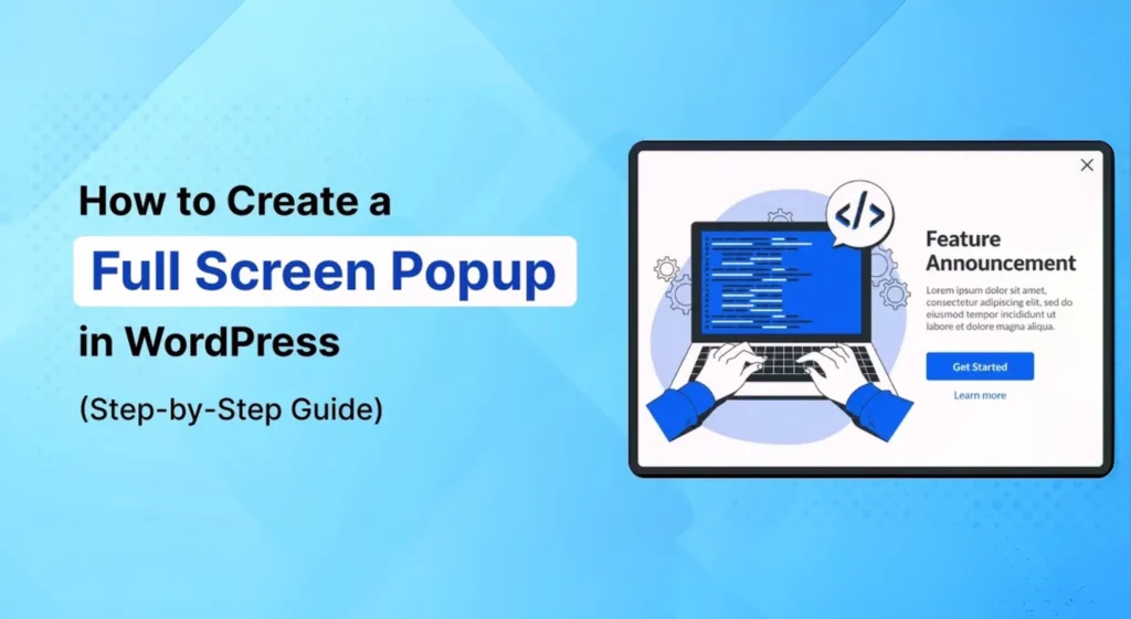
A full screen popup is a website overlay that expands across the entire browser window, temporarily replacing the visible page content with a single message, offer, or form.
Unlike a corner popup or a slide-in box, there’s no ambiguity about whether a visitor has seen it. The overlay sits directly in front of everything else on the page, which means the message either gets read or gets closed, with very little in between. That directness is the entire point of the format.
Most full screen popups follow a simple internal structure: a short headline, one or two lines of supporting text, a form or button, and a visible way to close it. Anything beyond that tends to work against the format rather than for it, since the whole appeal is how uncluttered and immediate it feels.
Full Screen Popup vs Smaller Popup Formats
It helps to know how a full screen popup compares to the other overlay types you might be choosing between.
| Format | Screen Coverage | Best For | Risk Level |
|---|---|---|---|
| Full screen popup | Entire browser window | Welcome messages, major announcements, high priority offers | Higher if timing or design is off |
| Centered box popup | Partial, with dimmed background | General email capture, standard discounts | Moderate |
| Slide-in | Small corner or edge panel | Lightweight offers on content heavy pages | Low |
| Floating bar | Thin strip at top or bottom | Sitewide announcements, ongoing promotions | Low |
A full screen popup earns its place when the message genuinely deserves that level of attention. A routine “10 percent off” offer usually doesn’t need the entire screen. A first time visitor welcome message, a major sale launch, or a legally required age gate often does.
When a Full Screen Popup Makes Sense (And When It Doesn’t)
Quick answer: A full screen popup makes sense when the message is important enough to justify briefly interrupting the entire page, such as a welcome message, a major promotion, or a required notice. It tends to work against you when it’s used for routine, low stakes offers that don’t need that much visual weight.
Good candidates for a full screen popup include:
- A welcome message greeting first time visitors on the homepage
- A store wide flash sale or a limited time seasonal promotion
- An important announcement, such as a policy change or a new product line
- A required overlay, like age verification or cookie consent
- A high value lead magnet you want every visitor to notice
Situations where a smaller format usually works better:
- A routine newsletter signup shown to every visitor on every page
- An offer shown repeatedly across multiple pages during a single session
- Any message aimed at visitors who are actively reading long form content, where interrupting too soon breaks their attention rather than earning it
The general rule is proportionality. The bigger the interruption, the more the message needs to justify it.
Common Full Screen Popup Use Cases
Full screen popups show up across a wide range of site types, usually built around one of a few recurring goals.
Welcome mats for new visitors. Shown once, briefly, when someone lands on a site for the first time, often introducing the brand or highlighting a starting offer before the visitor continues browsing.
Email list growth campaigns. Since the form takes up the whole screen, there’s little chance a visitor scrolls past it without noticing, which makes this one of the more reliable formats for building a list quickly.
Flash sales and time limited promotions. A short lived sale often benefits from the extra visibility a full screen format provides, since the goal is awareness within a narrow window rather than steady, ongoing exposure.
Lead generation for service based businesses. Consultation requests, demo bookings, and quote forms tend to convert better when there’s nothing else on screen competing for the visitor’s decision.
Required legal overlays. Age verification and cookie consent notices are often implemented as full screen popups simply because they need to be seen and acknowledged before anything else on the site loads.
How to Create a Full Screen Popup in WordPress
Here’s the full build process using YS LeadGen. The general sequence applies to most WordPress popup plugins that support full screen layouts.
Step 1: Install a Popup Plugin With Full Screen Support
Not every WordPress popup plugin includes a true full screen layout, so it’s worth confirming this before building anything around it.
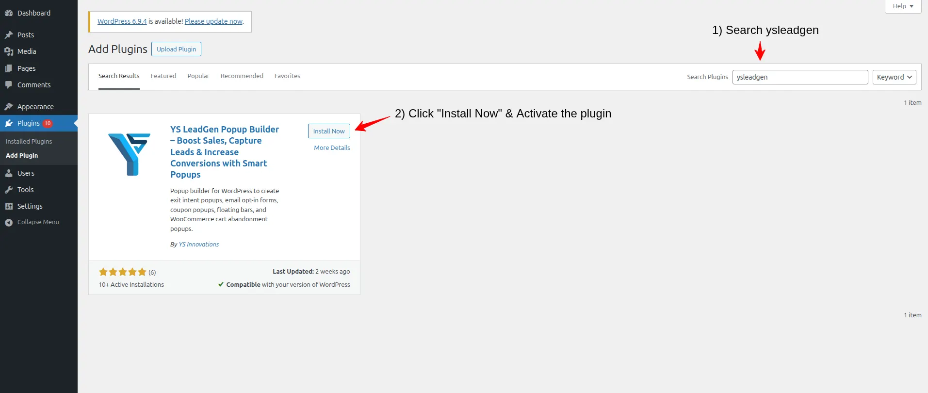
From your WordPress dashboard, go to Plugins, then Add New Plugin. Search for YS LeadGen, click Install Now, and then Activate. A new YS LeadGen menu will appear in your sidebar once activation finishes.
Look specifically for a plugin that offers a dedicated full screen template option, rather than one that only stretches a centered box slightly larger. The difference matters visually, especially on desktop screens.
Step 2: Set Up a New Campaign
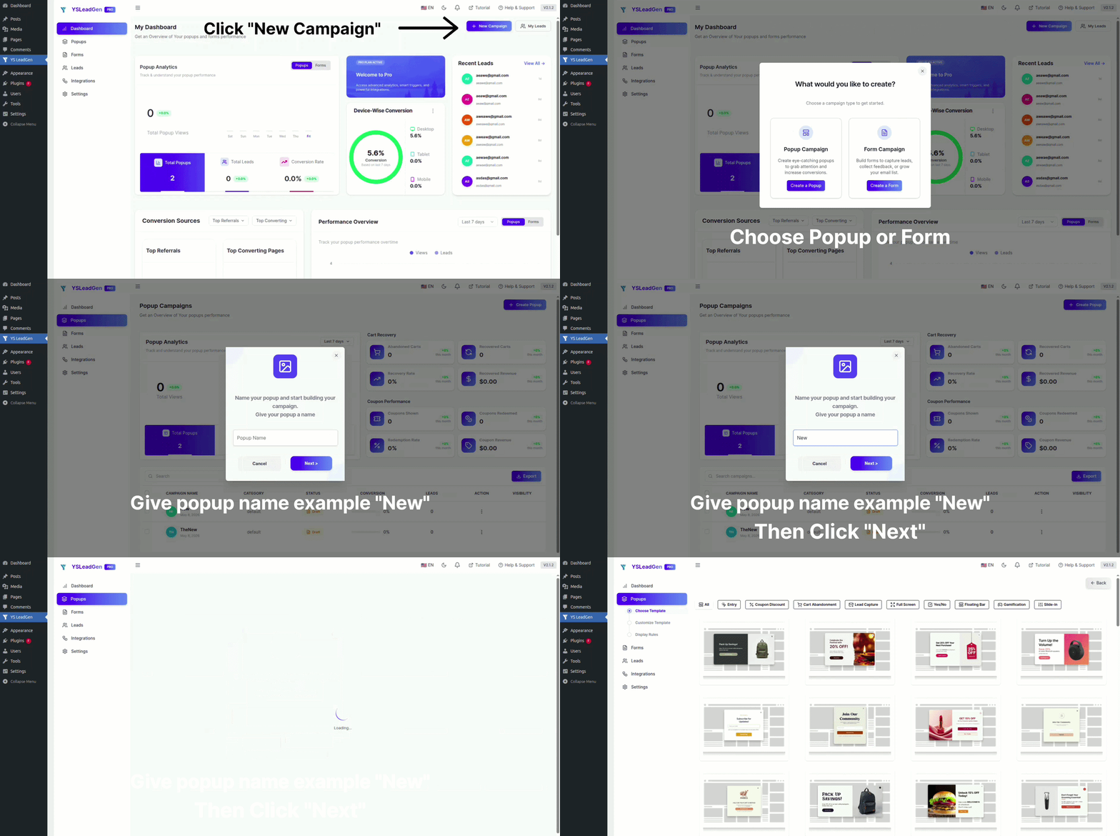
Inside YS LeadGen, click New Campaign, then Create a Popup. Name the campaign something you’ll recognize later, since most sites end up running several overlays for different purposes over time. Something like “Homepage, Welcome Mat, First Time Visitors” or “Sitewide, Flash Sale, Time Delay” keeps things organized as your campaign list grows.
Step 3: Choose a Full Screen Template
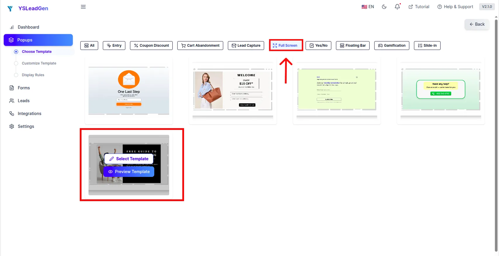
Select the full screen layout option from the template library, rather than a centered or slide-in format. At this stage, resist the temptation to pick the most visually elaborate option available. A clean, spacious full screen design generally performs better than a busy one, since the whole benefit of the format is clarity, not decoration.
If you’re building a welcome mat, look for a template built around a headline and a single form field. If you’re announcing a sale, a template with room for a strong image alongside the offer text usually works better.
Step 4: Write the Popup Content
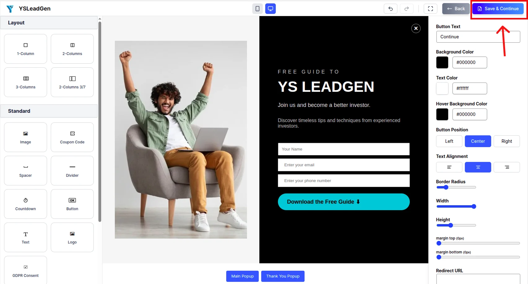
This step matters more for full screen popups than almost any other format, because there’s nowhere for a weak message to hide.
Start with a headline that states the offer or message plainly, without needing a second sentence to explain it. Something like “New Here? Get 15% Off Your First Order” tells a visitor everything they need to know in under two seconds. Follow it with one short supporting line, then a single, clearly labeled action, whether that’s a form field or a button.
Avoid stacking multiple offers or messages into one overlay. A full screen popup trying to sell a product, promote a newsletter, and announce a sale all at once tends to accomplish none of the three, since the visitor has to decide which message even matters before they can act on any of them.
Step 5: Add a Form or Call to Action
If the goal is capturing an email address, keep the form to a single field whenever possible. If the goal is a service inquiry, name and email is usually the practical limit before completion rates start dropping.
If there’s no form involved, such as a straightforward sale announcement, make sure the button clearly states what happens next, rather than a vague “Learn More.”
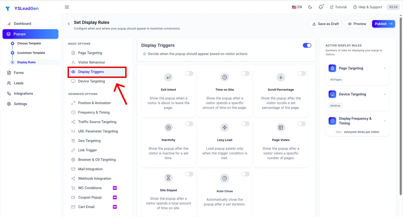
Step 6: Configure the Display Trigger
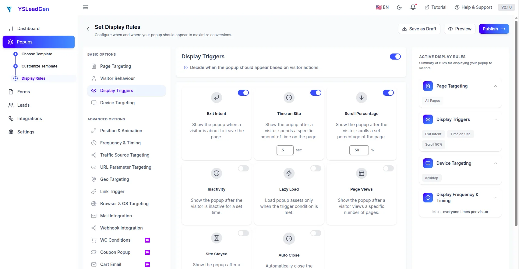
Choose when the popup appears based on its purpose:
- Short time delay, around three to five seconds, works well for welcome mats, giving the visitor just enough time to register where they’ve landed before the overlay appears.
- Scroll trigger suits campaigns aimed at engaged readers, since it waits until the visitor has shown genuine interest in the content before interrupting.
- Exit intent fits recovery style offers meant to catch someone right before they leave.
- Immediate page load tends to suit only time sensitive announcements, like a sale ending within hours, where speed of visibility matters more than easing the visitor in gently.
Step 7: Set Display Rules and Publish
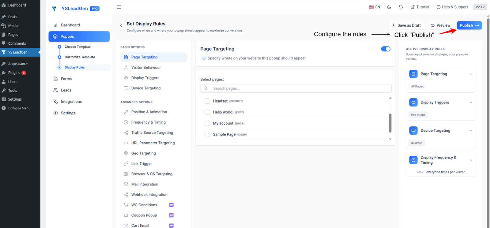
Decide where the popup should appear. A welcome mat generally belongs only on the homepage or landing pages, shown only to first time visitors. A sitewide sale announcement might run across the entire site for the duration of the promotion.
Before publishing, check the overlay on both desktop and mobile. Confirm the close button is easy to find and tap, the text doesn’t overflow or get cut off on a smaller screen, and the form or button actually works as expected. Once everything checks out, click Publish.
Writing Copy That Actually Gets Read
Because a full screen popup removes every distraction, the copy itself carries more weight than it would in a smaller format, where a busy layout might forgive a mediocre headline.
A strong full screen headline usually does two things at once: states the benefit and implies why now matters. Compare “Subscribe to Our Newsletter” against “Get Our Best Content Before Anyone Else, Free.” The second version gives a visitor an actual reason to care within the same amount of space.
Keep the supporting line short, ideally under twenty words, and resist the urge to explain the offer in full. A full screen popup isn’t the place for details. It’s the place for a clear enough hook that the visitor wants to take the next step, whether that’s filling out a form or clicking through to a page with more information.
Choosing the Right Trigger and Timing
Timing affects a full screen popup more noticeably than it does smaller formats, simply because the interruption is bigger.
Appearing the instant a page loads, before a visitor has even had a chance to see what the site is about, tends to feel abrupt regardless of how good the offer is. A short delay, even just three or four seconds, gives visitors enough context to receive the popup as relevant rather than random.
For content heavy pages like blog posts, a scroll based trigger generally outperforms a time based one, since it targets people who’ve already demonstrated some level of engagement rather than someone who just arrived.
For cart or checkout pages, exit intent remains one of the more reliable triggers, since it activates specifically at the moment a visitor shows signs of leaving rather than interrupting them mid-decision.
Full Screen Popup Design Mistakes to Avoid
A handful of recurring mistakes account for most of the frustration people associate with this format.
Hiding or shrinking the close button. If a visitor can’t find an obvious way to dismiss the popup, the reaction is rarely patience. It’s usually to leave the site entirely rather than search for an exit.
Triggering on every single page load, every session. Full screen popups lose their impact fast if the same visitor sees the identical overlay every time they return. Frequency capping exists specifically to prevent this.
Cramming multiple offers into one overlay. A full screen popup trying to do three things at once usually accomplishes none of them clearly.
Skipping mobile testing. A layout that looks clean on a desktop monitor can easily become cramped or broken on a phone screen, particularly if text sizing or image scaling wasn’t checked directly.
Using it for low stakes messages. Not every offer deserves the entire screen. Overusing the format for routine promotions trains visitors to see your site as more aggressive than it needs to be, which can quietly hurt trust over time.
Do Full Screen Popups Affect SEO or Google Rankings?
Quick answer: Not by default. Google specifically targets intrusive interstitials that block content immediately on page load on mobile devices, not full screen popups in general. A well timed, easily closable overlay does not carry an inherent SEO penalty.
The distinction that actually matters to Google’s ranking systems is user experience, not the popup format itself. An overlay that appears the instant a mobile visitor lands on a page, blocks the content entirely, and offers no easy way to close it is the kind of pattern that risks a ranking impact. A full screen popup that appears after a short, reasonable delay, includes a clearly visible close button, and doesn’t repeat excessively within a single session generally avoids that issue entirely.
If search visibility is a concern, a few habits keep a full screen popup on the safe side: wait at least a few seconds before showing it rather than triggering immediately, keep the close button large and easy to tap on mobile, and avoid showing the same overlay to the same visitor multiple times in one session.
Frequently Asked Questions
A full screen popup is a website overlay that expands to cover the entire browser window with a single focused message, offer, or form, removing every other visual distraction on the page while it’s displayed.
Mostly, yes. Welcome mat is simply the common name for a full screen popup that specifically greets first time visitors, usually shown briefly when someone lands on a site for the first time.
Not inherently. Problems tend to come from poor execution, an unclear close button, immediate triggering with no delay, or repeated display to the same visitor, rather than the format itself. A well built full screen popup with clear copy and reasonable timing is generally well received.
No, not by default. Google’s ranking systems specifically target intrusive interstitials that block mobile content immediately on page load with no easy way to close them. A full screen popup that appears after a short delay and includes an accessible close button doesn’t carry that same risk.
A short time delay, typically three to five seconds, tends to work best for welcome mats. It gives visitors just enough time to register the site before the overlay appears, which feels more natural than triggering the instant the page loads.
As few as possible. For simple email capture, one field is ideal. For service based lead generation, name and email is usually the practical maximum before completion rates begin to drop noticeably.
Yes. Most WordPress popup plugins, including YS LeadGen, support visitor based targeting, which lets you show a welcome mat only to new visitors while excluding people who’ve already seen it in a previous session.
They can be, but only with deliberate testing. Because the overlay covers the entire viewport, text sizing, image scaling, and close button placement all need to be checked specifically on a phone screen rather than assumed to scale correctly from desktop.
YS LeadGen supports full screen popup layouts alongside standard and exit intent formats, with template options, display triggers, and targeting rules built into a visual editor that doesn’t require coding.
Final Thoughts
A full screen popup works because it removes ambiguity. There’s no question about whether a visitor saw the message, only whether they chose to act on it or close it. That directness is what makes the format so useful for the moments that genuinely matter, a first impression, a major sale, an offer worth pausing for.
It’s also exactly why the format punishes weak execution more than smaller popups do. A vague headline, a hidden close button, or a delay that feels rushed will be far more noticeable when there’s nothing else on screen to soften it. Used sparingly, with clear copy and reasonable timing, a full screen popup can be one of the more effective tools on a WordPress site. Used everywhere, for everything, it quickly becomes the reason people leave.