A popup does not always have to ask visitors for everything at once. In many cases, asking for an email address, phone number, or several other details immediately can make the interaction feel like a form rather than a conversation.
A Multi-Step Popup takes a different approach. Instead of presenting the entire conversion process on a single screen, it breaks the interaction into smaller steps. The first step might ask a simple question or present an offer, the second can collect contact information, and the final step can confirm the action or guide the visitor toward the next stage.
This approach can be useful for businesses that want to increase email subscribers, generate and qualify leads, promote discounts, recover abandoning visitors, or create more structured conversion flows.
In this guide, we’ll explain what a Multi-Step Popup is, how it works, why businesses use it, and how to create one in WordPress using YS LeadGen.
What Is a Multi-Step Popup in WordPress?
A Multi-Step Popup is a popup that guides visitors through several screens instead of displaying the entire message or form at once.
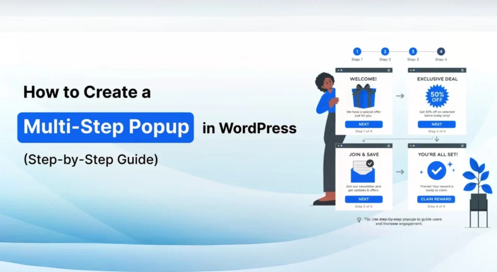
For example, the first screen might ask a simple question such as whether the visitor wants a discount. If the visitor selects “Yes,” the next screen can request their email address. The final screen can confirm that the coupon has been sent and encourage them to continue shopping.
The main idea is to divide a larger conversion action into smaller interactions. Instead of asking visitors to complete everything immediately, the popup guides them through the process one step at a time.
How Multi-Step Popups Work
A Multi-Step Popup works like a short guided journey. Each screen has a specific purpose, and the visitor moves to the next screen after completing the current action.
A typical flow could look like this:
Step 1 → Hook or Question → Step 2 → Form → Step 3 → Confirmation
For example:
Step 1: “Would you like 15% OFF your next order?”
Step 2: “Where should we send your coupon?” – [Email Address]
Step 3: “Your coupon is on the way!”
This structure separates the initial engagement from the information-collection stage. Each screen can focus on one action rather than forcing the visitor to process everything at once.
Why Businesses Use Multi-Step Popups
Businesses use Multi-Step Popups for several different conversion goals. They can be used to collect email subscribers, generate leads, qualify prospects, promote offers, recover potential customers, and guide visitors toward a specific action.
One reason businesses use this format is that it allows the campaign to start with a relatively simple interaction. Once a visitor chooses to continue, the following step can request the information needed to complete the conversion.
The structure can also be adapted to different types of websites. An online store might use a discount or cart-recovery flow, while a service business could use a qualification question before asking a prospect for contact details. A blog could use a simpler flow focused on newsletter subscriptions.
Common Types of Multi-Step Popups
The structure of the popup can change depending on the campaign objective. Common examples include:
- Lead Generation Popup – Collect contact information from potential customers.
- Newsletter Signup Popup – Encourage visitors to subscribe to an email list.
- Discount or Coupon Popup – Offer a discount before asking for an email address.
- WooCommerce Cart Recovery Popup – Attempt to recover visitors who are leaving without completing a purchase.
- Consultation Request Popup – Collect information from visitors interested in a service.
- Quiz or Survey Popup – Ask questions across multiple screens to understand visitor preferences or requirements.
Benefits of Multi-Step Popups
Lower Initial Friction
One of the main advantages of a Multi-Step Popup is that the first interaction can be kept simple. Instead of opening with a long form, you can begin with a question, offer, or simple choice.
For example, asking “Would you like 15% off?” requires less effort than immediately presenting a form with several fields.
Once the visitor chooses to continue, the following screen can request the information needed to complete the offer.
Better Lead Qualification
Multi-step flows can also be useful when you need to understand whether a visitor is a suitable lead before asking for their contact details.
A service business, for example, could first ask what type of service the visitor needs. Based on that answer, the next screen could collect their name, email address, or phone number.
This gives businesses an opportunity to structure the lead-generation process around the visitor’s requirements instead of presenting the same form to everyone.
More Focused User Experience
A long form can feel overwhelming when everything is presented on a single screen. Breaking the interaction into smaller steps makes each stage easier to understand.
The visitor can focus on one question or action at a time, while the campaign gradually moves toward the final conversion.
Useful for Different Conversion Goals
Multi-Step Popups are flexible enough to support different marketing objectives. The same basic structure can be adapted for discounts, newsletter subscriptions, lead qualification, consultations, quizzes, surveys, and other campaigns.
The content and number of steps can be changed according to what the campaign needs.
Better Control Over the Visitor Journey
With multiple steps, you have more control over how the visitor moves from the initial message to the final action.
You can decide what the visitor sees first, what information is requested next, and what happens after the form is completed. This makes it possible to create a more intentional conversion flow rather than relying on a single generic popup.
More Relevant Offers
A multi-step flow can also help you present an offer that is more closely connected to what the visitor has selected or indicated.
For example, a visitor who chooses a particular service category can be guided toward a relevant consultation or information request. This can make the popup feel more connected to the visitor’s intent.
Easier Testing and Optimization
Because the popup is divided into individual stages, you can evaluate the flow more closely and identify areas that may need improvement.
If visitors engage with the first step but do not complete the form, for example, you can review the second step rather than treating the entire campaign as one interaction.
How to Create a Multi-Step Popup in WordPress
Creating a Multi-Step Popup in WordPress is easier than it may initially seem. You do not need to build each screen from scratch with custom code. A popup builder can handle the basic structure, while you focus on the questions, offers, forms, and messages that make up the actual visitor journey.
Before creating the popup, it helps to decide what you want the visitor to do at the end of the flow. You might want to collect an email address, qualify a lead, offer a discount, promote a free trial, or recover a visitor who is about to leave.
In this tutorial, we will use YS LeadGen to create the Multi-Step Popup. The same general process can be adapted for email subscriptions, lead qualification, WooCommerce offers, and other conversion campaigns.
Step 1: Install the Multi-Step Popup Plugin
The first step is to install a WordPress popup plugin that supports Multi-Step Popup functionality.
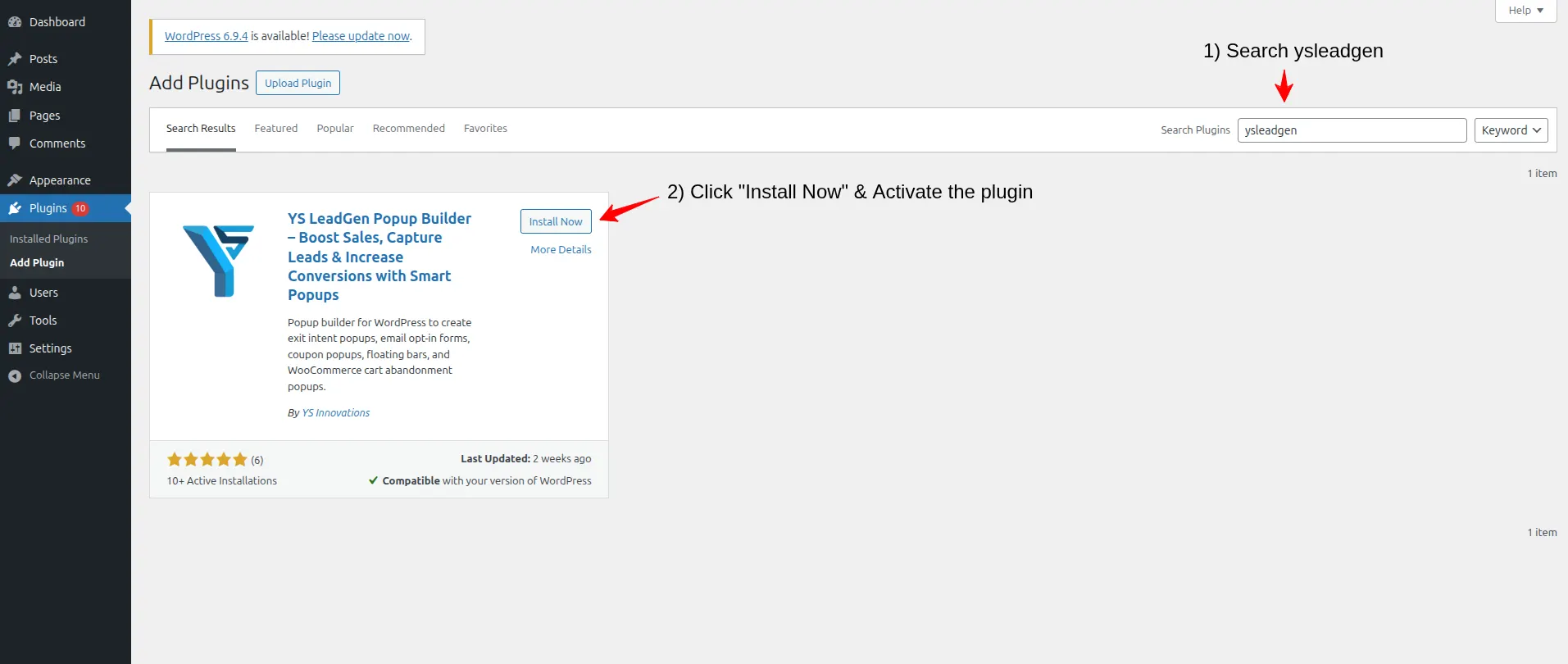
From your WordPress dashboard, go to:
Plugins → Add New Plugin
Use the search bar to find:
YS LeadGen
Then click Install Now and, once the installation has finished, click Activate.
After activation, the YS LeadGen menu will be available in your WordPress dashboard. From there, you can create and manage your popup campaigns.
Why Choosing the Right Popup Plugin Matters
Not every popup plugin provides the same level of control for multi-step campaigns. If you are planning to build more than a simple email form, look for features that allow you to create multiple screens and control how visitors move between them.
Useful capabilities include:
- Multi-step popup flow support
- Individual step design controls
- Button and form elements
- Responsive popup layouts
- Smart display rules
- Conversion-focused templates
- Flexible customization options
A suitable popup builder makes it easier to experiment with different flows without having to develop a separate custom solution for every campaign. YS LeadGen is designed to provide these controls from within WordPress.
Step 2: Create a New Popup Campaign
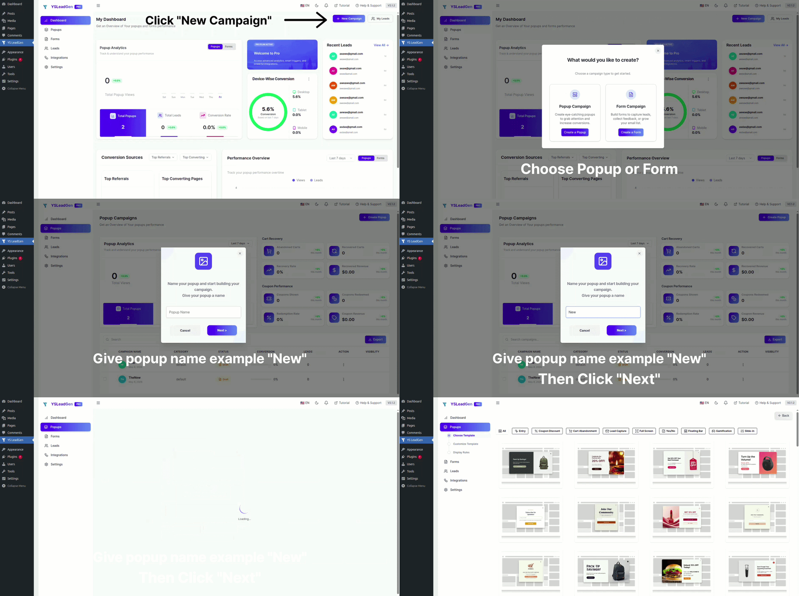
Once YS LeadGen is installed and activated, create a new campaign for your Multi-Step Popup.
From the WordPress dashboard, go to:
YS LeadGen → New Campaign
Then select:
Create a Popup
You will be asked to give the campaign a name. Choose something descriptive that makes the purpose of the campaign obvious when you return to it later.
For example:
- Multi-Step Discount Popup
- Lead Qualification Popup
- Newsletter Multi-Step Signup
- Free Trial Request Flow
Clear campaign names become particularly useful once you have several popup campaigns running on different pages or for different audiences.
Why Campaign Structure Is Important
It is common for a website to have more than one popup campaign. You might use one campaign for a homepage promotion, another for blog visitors, a separate WooCommerce discount campaign, and another for email subscriptions or seasonal offers.
Keeping these campaigns separate gives you better control over targeting and makes it easier to evaluate how each campaign performs. Instead of changing one large popup whenever your marketing goal changes, you can maintain individual campaigns for specific purposes.
Step 3: Choose a Popup Template
After creating the campaign, choose a template that matches the goal of your Multi-Step Popup.
YS LeadGen provides templates for different types of campaigns, including lead generation flows, newsletter signups, discount claim popups, WooCommerce cart recovery, free consultation requests, and quiz or survey flows.
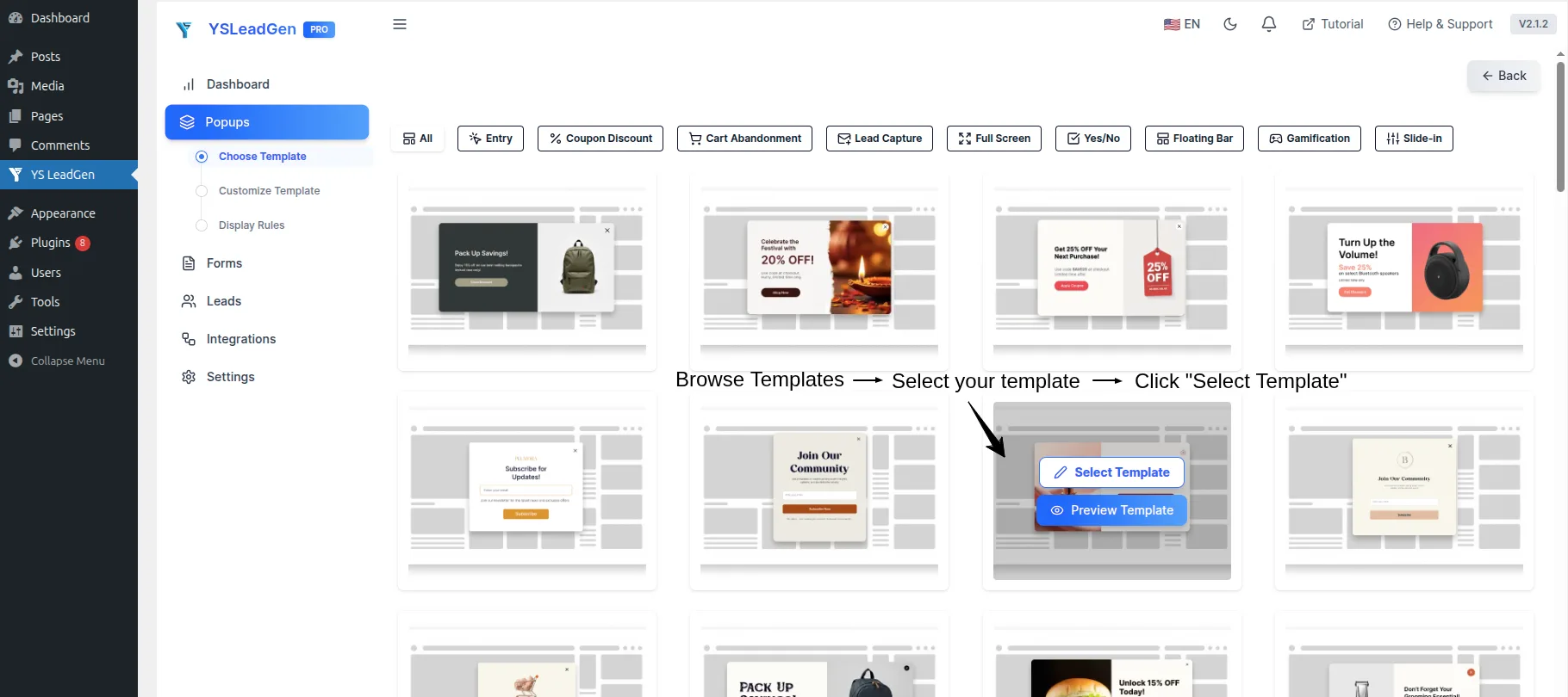
Choose a template based on three things: your website’s visual style, the purpose of the campaign, and what the visitor is likely to expect on that particular page.
For example, a discount campaign on a WooCommerce product page could begin with a simple Yes/No question. A service page could use a question-based first step to qualify the visitor, while a blog article might use a straightforward email signup flow.
The template is only the starting point. You should still customize the content and structure so that the popup fits the actual campaign rather than relying on the default wording.
Tips for Choosing a Multi-Step Popup Template
Keep the design clean and make sure each step has one clear purpose. Avoid choosing a template simply because it contains more visual elements. A simple layout is often easier to adapt and gives your headline, offer, question, and CTA enough space to remain clear.
It is also useful to maintain the same visual identity throughout the flow. The colors, typography, spacing, and overall style should feel like part of the same website from the first screen through the final confirmation.
For example:
- Use a Yes/No first step for a discount campaign on product pages.
- Use a question-based first step for lead generation on service pages.
- Use a simple email step for newsletter campaigns on blog articles.
The template should support the visitor’s journey rather than becoming the focus of the popup itself.
Step 4: Design Each Step of the Popup
Once you have selected a template, the next step is to customize each screen in the Multi-Step Popup. A typical campaign can use two to four steps, depending on how much information you need from the visitor and what you want them to do.
The important thing is to give every step a clear purpose. Instead of putting the entire offer, form, and message on one screen, break the interaction into smaller actions that are easier for the visitor to understand and complete.
Step 1: Create the Hook
The first screen should give visitors a reason to continue. Start with a clear headline that communicates the value of taking the next step, followed by a short explanation and an obvious call to action.
For example, a discount popup could start with:
Headline:
“Want 15% OFF Your Next Order?”
Buttons:
“Yes! Give Me My Discount”
“No Thanks, I’ll Pay Full Price”
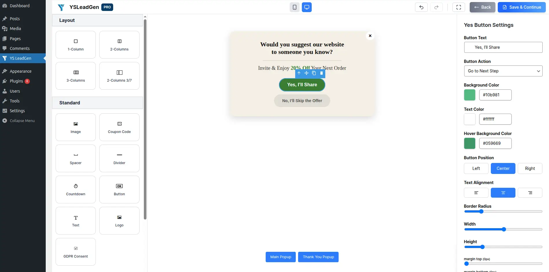
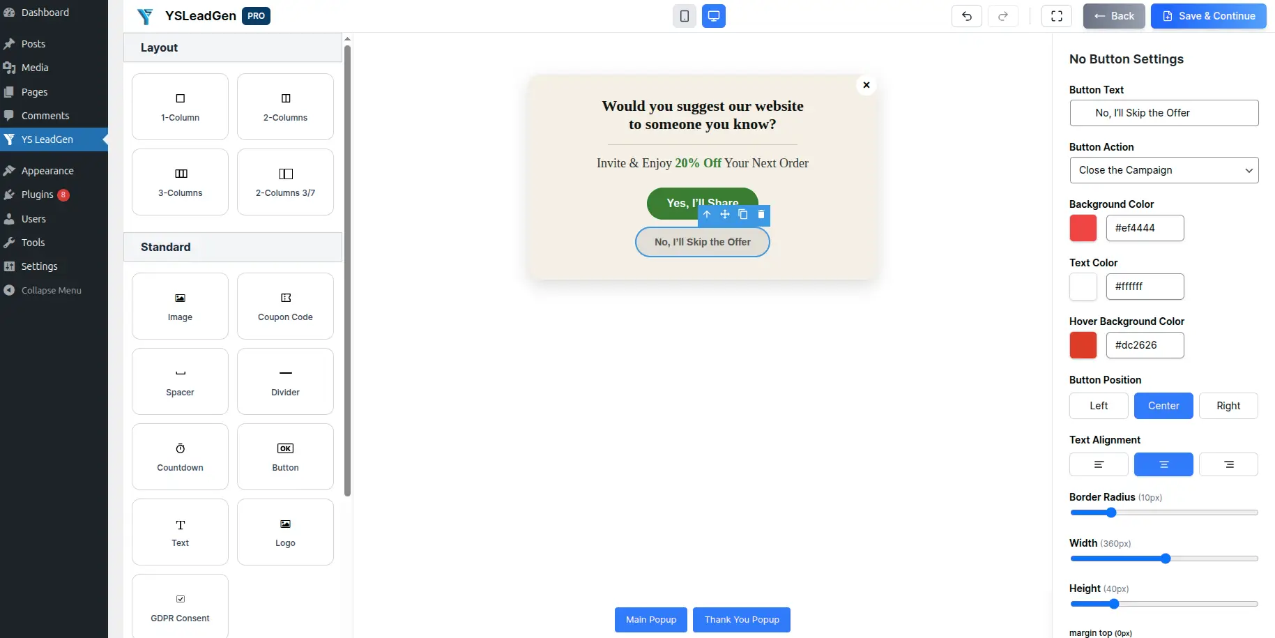
The purpose of this first screen is to get the visitor to make a simple decision. Asking for an email address or other information immediately can create more friction, whereas a straightforward first interaction gives the visitor an easy way to continue.
Step 2: Add the Lead Capture Form
After the visitor chooses to continue, the second step can collect the information you actually need.
For example, the next screen could say:
Headline:
“Great! Where Should We Send Your Coupon?”
Field:
Email Address
Button:
“Send My Coupon”
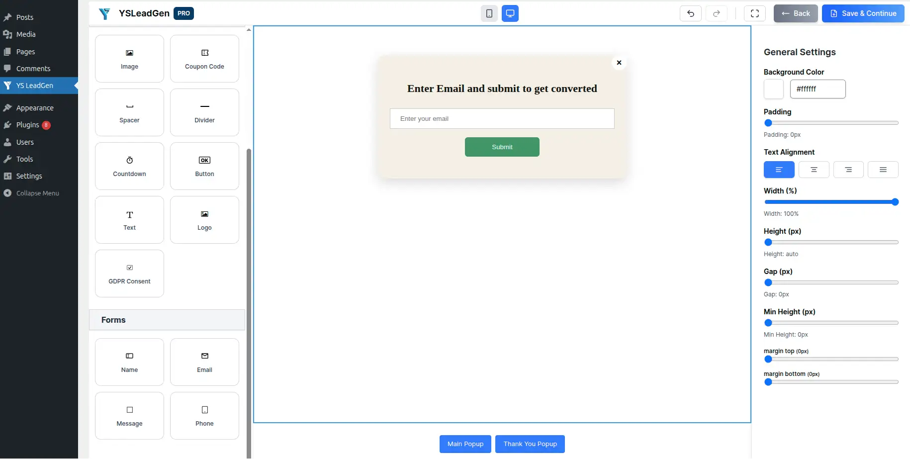
Keep this step focused. If the campaign only requires an email address, there is little reason to ask for several additional fields. A short form is generally easier for visitors to complete and keeps the flow moving.
For lead-generation campaigns, you can adapt the fields to the information you genuinely need, such as name, company, phone number, or a qualifying question. The form should still remain as short as practical for the campaign objective.
Step 3: Create the Confirmation Screen
The final step should tell visitors what happens next. This is particularly important when they have submitted information or claimed an offer.
For example:
Headline:
“Your 15% Discount Is On the Way!”
Message:
“We’ve sent your coupon code to your email. Use it on your next order.”
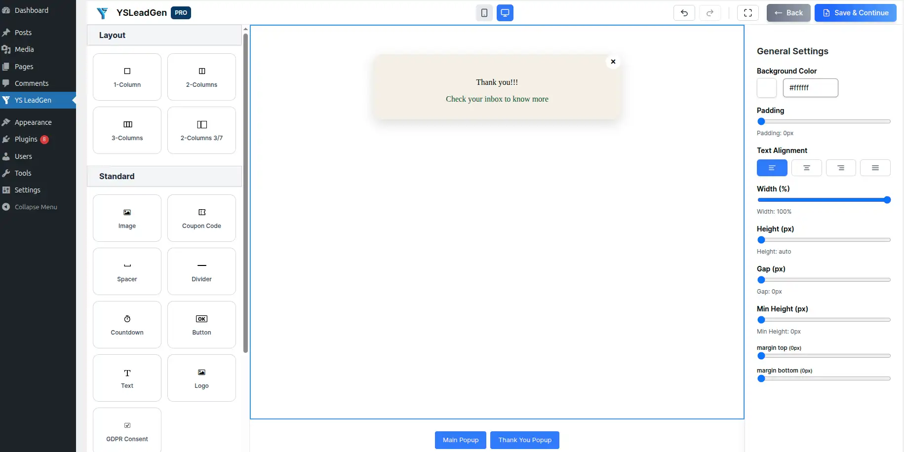
You can also include a secondary CTA if there is an immediate action you want the visitor to take, such as continuing to the store, viewing a product, booking a consultation, or starting a free trial.
The confirmation screen should provide a clear sense of completion rather than leaving the visitor wondering whether their submission worked.
Best Practices When Designing Each Step
Keep the visual style consistent from one screen to the next. Visitors should feel that they are moving through one continuous popup rather than seeing several unrelated designs.
It is also useful to give each screen one primary action. If a step is asking a question, make the answer obvious. If it is collecting an email address, keep the form focused on that action. If it is confirming a submission, clearly explain what happens next.
For flows with three or more steps, a progress indicator can also help visitors understand where they are in the process. Keep the branding consistent, use readable typography, and avoid excessive animation that could distract from the actual interaction.
Step 5: Configure When the Popup Should Appear
After designing the individual steps, the next decision is when visitors should see the popup. A well-designed Multi-Step Popup can still perform poorly if it appears too early or at the wrong point in the visitor journey.
In YS LeadGen, go to the campaign’s Display Rules and open the Display Trigger settings. From there, you can choose the event that should activate the popup.
The available trigger options include:
- Exit Intent – Show the popup when a visitor is about to leave the page.
- Scroll Trigger – Display it after the visitor has viewed a specific portion of the page.
- Time Delay – Wait for a defined amount of time before displaying the popup.
- Click Trigger – Open the popup when a visitor clicks a specific button, link, or element.
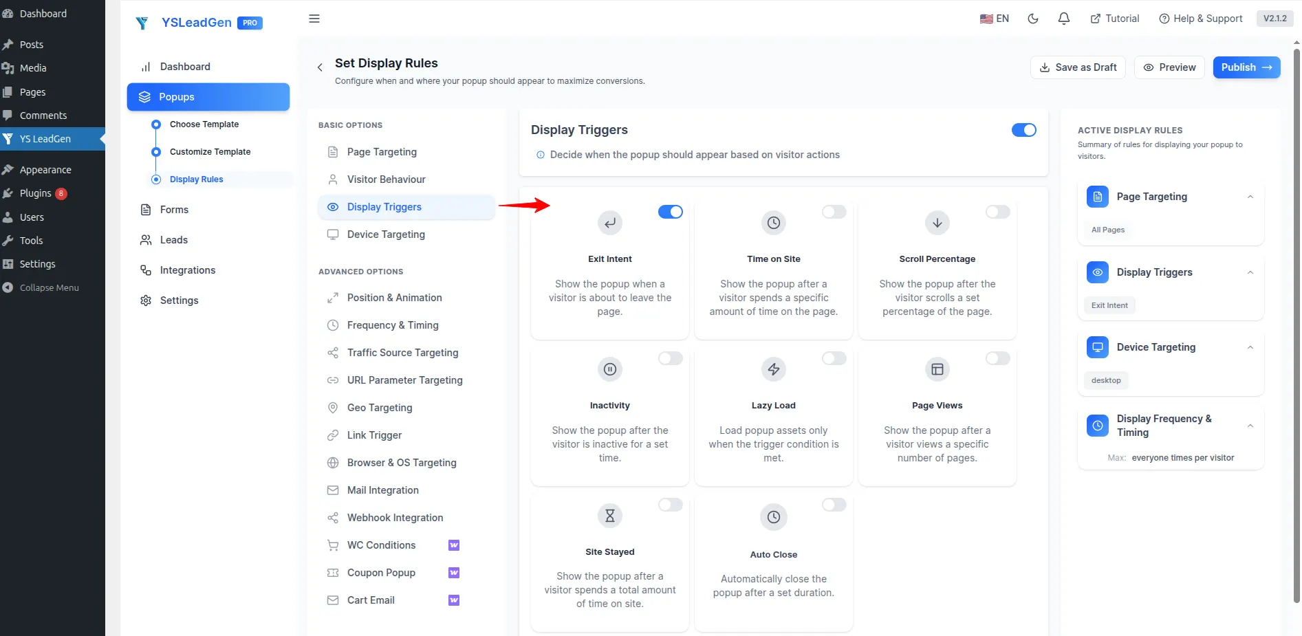
The right trigger depends on the purpose of the campaign. For example, an exit-intent trigger can work well for an offer aimed at visitors who are about to leave, while a scroll trigger can be useful when you want visitors to first read some of your content before seeing a lead-generation offer.
Common Trigger Settings
For many campaigns, a few simple starting points are enough:
- Exit Intent for visitors who are leaving the page
- 15-second delay for visitors who have spent some time on the page
- 50% scroll depth for content-based campaigns
These settings should not be treated as fixed rules for every website. The right trigger depends on the page, audience, and campaign objective. The important principle is to avoid showing the popup immediately before visitors have had an opportunity to understand the page or offer.
Smart triggers can make the interaction feel more relevant because the popup appears in response to visitor behavior rather than simply appearing as soon as the page loads.
Choose the Trigger Based on Visitor Intent
Think about what the visitor is doing before selecting a trigger. Someone reading a long blog article may need more time before seeing an email signup offer, while someone browsing a product page may respond better to a discount or purchase-related message.
For example, a blog newsletter popup could use a scroll or time-based trigger, while a cart recovery campaign could use exit intent. A click-triggered popup can also be useful when you want the visitor to actively request the offer rather than interrupting their browsing experience.
The trigger should support the purpose of the campaign and appear at a point where the offer makes sense in the visitor’s journey.
Step 6: Set Display Rules, Device Targeting, and Frequency
After configuring the trigger, you need to decide where the popup should appear and which visitors should see it. Display rules are important because the same Multi-Step Popup may not be appropriate across every page of your website.
In YS LeadGen, you can configure the popup’s display rules based on specific pages or sections of your website. Depending on the campaign, you can display it across the entire website or target areas such as the homepage, product pages, checkout pages, blog posts, landing pages, or category pages.
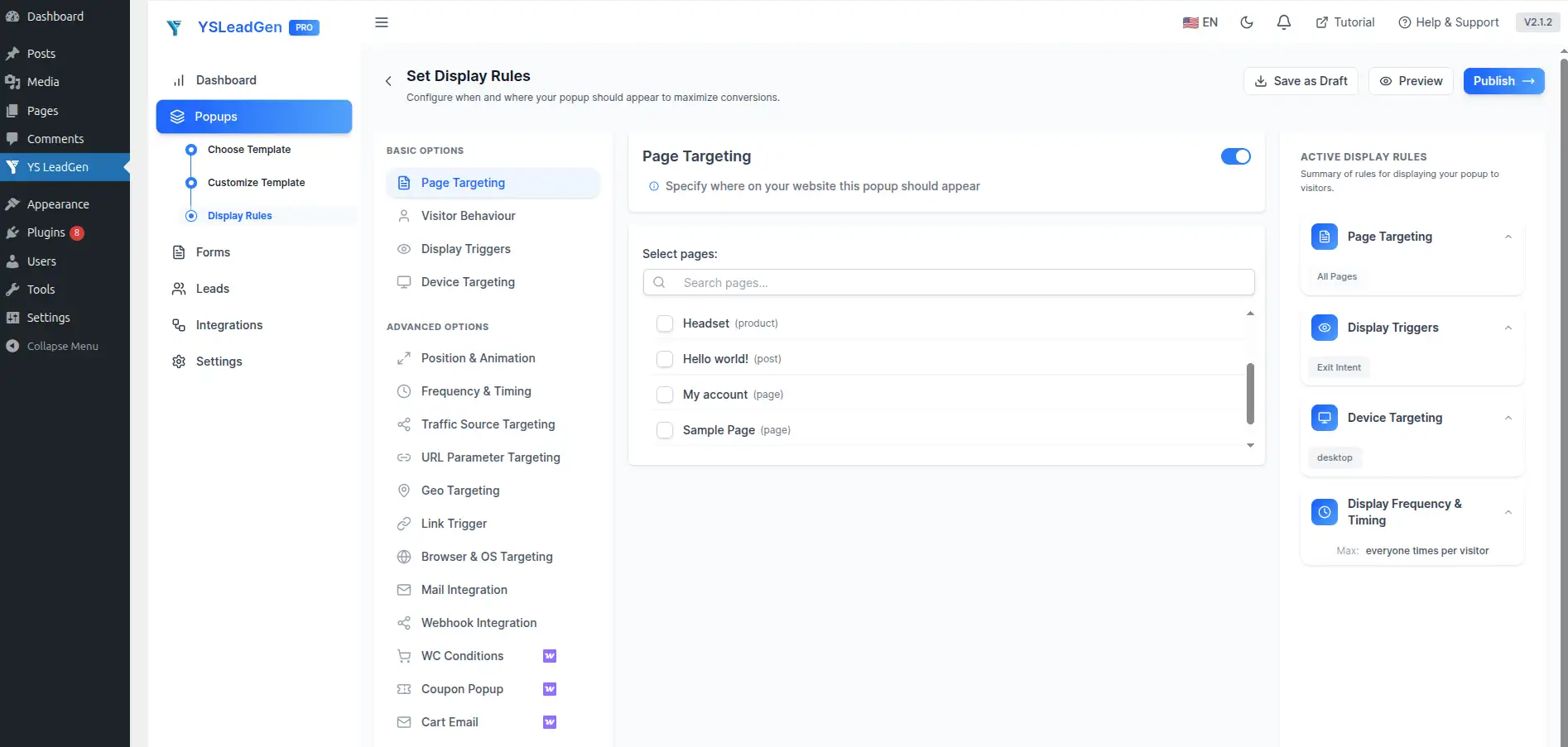
For example, a discount popup could be limited to WooCommerce product pages, while a newsletter signup could be displayed only on blog posts. A lead qualification popup could instead be shown on specific service or landing pages where visitors are more likely to be interested in contacting the business.
Targeting the right pages keeps the campaign relevant and prevents visitors from seeing offers that have little connection with what they are currently viewing.
Configure Device Targeting
You can also control which devices should display the popup. This allows you to create different targeting conditions for desktop and mobile visitors when required.
Before publishing, make sure the popup layout works properly on smaller screens. A design that looks comfortable on a desktop can become difficult to use if the buttons, form fields, or text do not fit properly on mobile.
Set Display Frequency
Frequency controls help prevent the same visitor from seeing the popup repeatedly.
For example, you can configure the campaign so that it appears once per session, hide it after the visitor has completed the form, or delay the next appearance after the visitor has already seen the campaign.
These settings are particularly useful for multi-step campaigns because repeatedly showing the same popup after a visitor has already interacted with it can create an unnecessarily intrusive experience.
Step 7: Publish and Test the Multi-Step Popup
Once the design, triggers, and display rules are configured, the popup is ready to be published. However, it is worth testing the complete flow before treating the campaign as finished.
Click Publish to activate the campaign, then visit the relevant page on your website and test it as a normal visitor would.
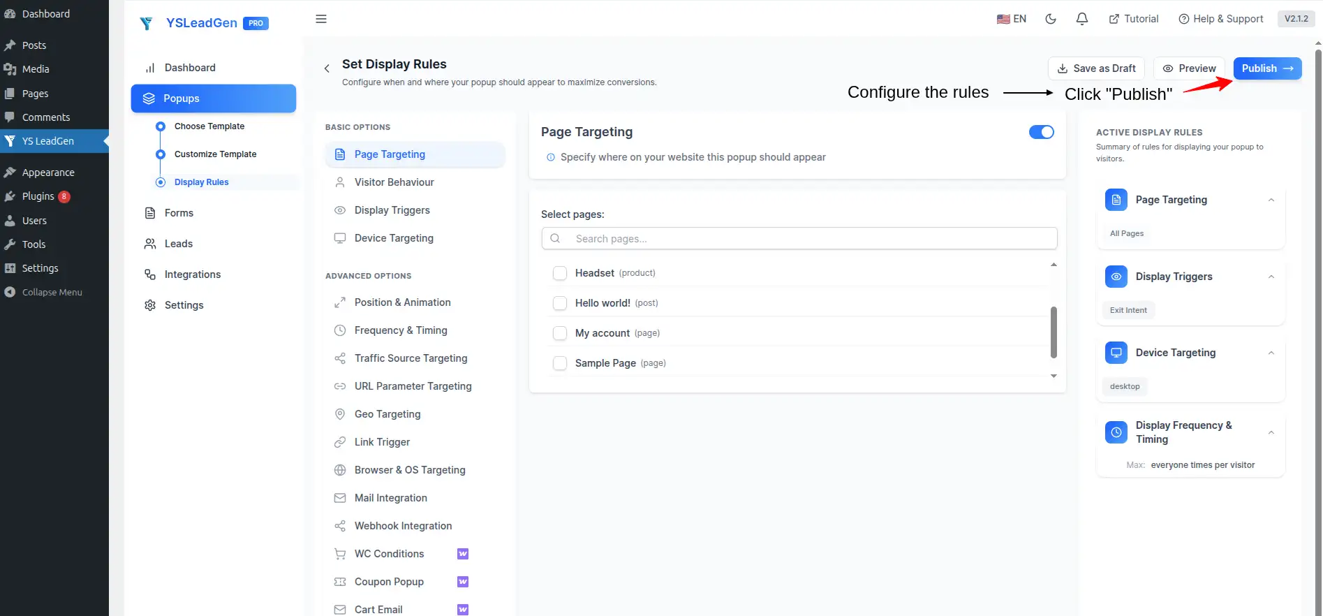
Go through every step from beginning to end. Check that the first CTA moves to the correct next step, the form accepts the required information, the submission works correctly, and the confirmation message appears as expected.
You should also test the popup on both desktop and mobile devices. Pay attention to button sizes, text readability, form fields, spacing, and whether the popup fits correctly within the screen.
It is also important to verify the actual visitor experience rather than checking only whether the popup appears. Confirm that the configured trigger works, the popup appears on the intended pages, frequency rules behave correctly, and visitors who complete the flow are handled as expected.
A short test before launching the campaign can help catch configuration or usability problems before they affect real visitors.
Tips for Creating Effective Multi-Step Popups
Creating the popup is only part of the process. The way you structure the questions, offer, and calls to action has a direct impact on how easy the flow is for visitors to complete.
Start with a clear objective. Before adding multiple steps, decide exactly what you want the visitor to do. A popup designed to collect email subscribers may need only a simple two-step flow, while a lead qualification campaign may require additional questions before asking for contact information.
Keep the first interaction simple and low commitment. Asking visitors for several details immediately can make the popup feel like a form rather than a conversation. A simple question, choice, or offer can give visitors a reason to continue before you request their information.
The design should also remain consistent throughout the flow. Use the same branding, typography, colors, spacing, and visual style across each step so the popup feels like one continuous experience. Keep the number of steps reasonable and make sure every screen has a clear purpose.
Best Practices for Multi-Step Popups
1. Start With a Low-Commitment First Step
The first step should be easy to complete. Instead of immediately asking for an email address, phone number, or several other details, begin with a simple question or choice that requires very little effort.
For example, a discount campaign could start with:
“Would you like 15% off your next order?”
The visitor can then choose Yes or No. If they choose Yes, the next step can request their email address to deliver the coupon.
This approach keeps the initial interaction simple and gives visitors a clear reason to continue through the flow.
2. Give Each Step One Clear Action
Every screen should have one primary purpose. If a step is designed to ask a question, focus on the question. If it is collecting an email address, make the form the main action. If it is confirming a submission, explain what happens next.
Avoid placing too many buttons, links, fields, or competing messages on the same screen. A focused layout makes the journey easier to understand and keeps visitors moving toward the final conversion.
3. Offer Something Valuable
Visitors are more likely to complete a Multi-Step Popup when there is a clear reason to do so. The incentive should match the purpose of the campaign and provide enough value to justify sharing information or completing the requested action.
Depending on the website and campaign, the offer could be a discount, coupon, free resource, exclusive content, free consultation, free trial, or another relevant benefit.
The important point is to make the value clear before asking the visitor to provide information.
4. Use a Clear Headline on Every Step
Do not assume that visitors will automatically understand what the next screen is asking them to do. Each step should have a concise headline that explains the purpose of that screen.
For example, after a visitor accepts a discount, the next screen could use:
“Where Should We Send Your Coupon?”
This creates a natural connection between the previous action and the next one, making the flow easier to follow.
5. Keep the Design Consistent
The different screens in a Multi-Step Popup should feel like parts of the same campaign. Use consistent colors, fonts, buttons, spacing, and branding throughout the flow.
A visitor should not feel as though they have moved from one unrelated popup to another when progressing from the first question to the form and then to the confirmation screen. Consistency makes the interaction feel more polished and helps maintain trust.
6. Use Strong and Clear CTAs
Your call-to-action should tell visitors exactly what will happen when they click it. Generic labels such as “Submit” or “Continue” can work, but a more specific CTA can make the purpose of the action clearer.
For example, instead of simply using “Submit”, a discount campaign could use “Send My Coupon”, while a consultation campaign could use “Request My Consultation.”
The CTA should match the action being completed on that particular step and make the next stage of the journey clear.
7. Avoid Making the Popup Too Long
Multi-step does not mean you need to create a long series of screens. For most campaigns, two or three steps can be enough to separate the initial interaction, information collection, and confirmation.
A fourth step can make sense when you need additional qualification or information, but adding unnecessary screens can make the process feel longer than it needs to be. Avoid creating five or more steps unless the campaign genuinely requires that level of interaction.
8. Optimize for Mobile Visitors
A Multi-Step Popup should work comfortably on smaller screens as well as desktop devices. Make sure the popup fits within the mobile viewport and that visitors can easily read the text, select an option, enter their information, and tap the CTA.
Pay particular attention to button size, form-field spacing, headline length, and the amount of content displayed on each screen. A layout that works well on desktop may need adjustments before it provides the same experience on mobile.
9. Use Targeted Display Rules
Avoid showing the same campaign to every visitor simply because it is available. Use the display rules to connect the popup with the page and visitor intent.
For example, a product discount popup can be limited to product pages, while a newsletter campaign can be shown on blog content. A lead qualification flow may be more appropriate for specific service or landing pages.
Targeted display rules help keep the message relevant and reduce unnecessary interruptions for visitors who are unlikely to benefit from the offer.
10. Test and Optimize the Campaign
Publishing the popup should not necessarily be the final step. After the campaign is live, review how visitors interact with the different stages and look for areas where the flow could be improved.
Test different headlines, offers, CTA wording, step structures, and display conditions where appropriate. If visitors frequently begin the popup but do not complete it, review the step where they are dropping off and consider whether the question, form, or offer can be simplified.
A Multi-Step Popup works best as an ongoing conversion experiment rather than a campaign that is designed once and never revisited.
Common Mistakes to Avoid
Multi-Step Popups can be useful for lead generation and conversion campaigns, but poor implementation can make the experience frustrating for visitors. The biggest problems usually come from making the flow unnecessarily complicated or showing the popup without considering the visitor’s context.
Avoid asking for too much information in the first step. Starting with a long form can create unnecessary friction before visitors have understood the value of completing the popup. It is also important not to add more steps than the campaign actually needs. If a simple two-step flow can achieve the same goal, there is little reason to make visitors go through five screens.
Another common mistake is using unclear headlines or weak calls to action. Every step should make it obvious what the visitor is being asked to do and what they can expect after clicking the CTA. Similarly, avoid inconsistent designs between steps, poor mobile layouts, and display rules that cause the same popup to appear repeatedly.
Before launching the campaign, test the complete flow on both desktop and mobile devices. Check the triggers, page targeting, form submission, step transitions, and frequency settings so that the experience works as intended.
Conclusion
A Multi-Step Popup gives WordPress website owners a practical way to break a larger conversion action into smaller, easier interactions. Instead of presenting a long form or a large amount of information at once, you can guide visitors through a sequence that begins with a simple question or offer and gradually moves toward the final action.
The process starts with choosing a suitable popup builder and creating a campaign, followed by selecting a template and designing each individual step. From there, triggers and display rules determine when and where the campaign appears, while device and frequency settings help keep the experience relevant.
The most effective approach is to keep the flow focused. Give visitors a clear reason to continue, keep each step centered around one action, make the offer understandable, and avoid collecting information that you do not actually need. Once the campaign is published, test it with real visitor scenarios and continue refining the experience based on how people interact with it.
Frequently Asked Questions
A Multi-Step Popup is a popup that guides visitors through two or more screens instead of presenting all the information or form fields at once. Each step has a specific purpose, such as asking a question, collecting contact information, or confirming an action.
Multi-Step Popups can make larger conversion actions easier to complete by breaking them into smaller interactions. They can be used for lead generation, email subscriptions, discounts, qualification, and other campaigns.
The source recommends keeping the flow relatively short. Two or three steps are suitable for many campaigns, while additional steps may be useful when more information or qualification is genuinely required.
Yes. A common structure is to use the first step to engage the visitor with a question or offer, followed by a form that collects their contact information.
Yes. Multi-Step Popups can be used for WooCommerce-related campaigns such as discounts and cart recovery. Display rules can also be used to target specific product or store pages.
Yes. Display rules allow you to control where a campaign appears. For example, you can create separate campaigns for product pages, blog posts, landing pages, or other sections of your website.
Yes. The popup should be tested on mobile devices to make sure the content, buttons, form fields, spacing, and overall layout remain easy to use on smaller screens.
The source lists several trigger options, including exit intent, scroll-based triggers, time delays, and click triggers. The appropriate option depends on the campaign and the visitor’s context.
Use frequency controls to limit how often the campaign appears. You can configure options such as showing the popup once per session, hiding it after a visitor completes the form, or delaying another appearance.
Test the complete visitor journey from the first screen through the final confirmation. Check the triggers, display rules, step transitions, form submission, mobile layout, and frequency settings before considering the campaign ready for visitors.