- Key Takeaways
- What’s Covered in This Guide
- Why High-Converting Popups Matter
- What Makes a Popup Convert?
- 1. Welcome Popup Example
- 2. Exit-Intent Popup Example
- 3. Email Newsletter Popup Example
- 4. First Purchase Discount Popup Example
- 5. Spin-the-Wheel Popup Example
- 6. Limited-Time Offer Popup Example
- 7. Cart Abandonment Popup Example
- 8. Lead Magnet Popup Example
- 9. Social Proof Popup Example
- 10. Multi-Step Popup Example
- Popup Examples Comparison Table
- Are Popups Bad for SEO? The 2026 Answer
- Best Practices for Creating High-Converting Popups
- Common Popup Mistakes to Avoid
- How to Choose the Right Popup Type for Your Goal
- Frequently Asked Questions
- Conclusion
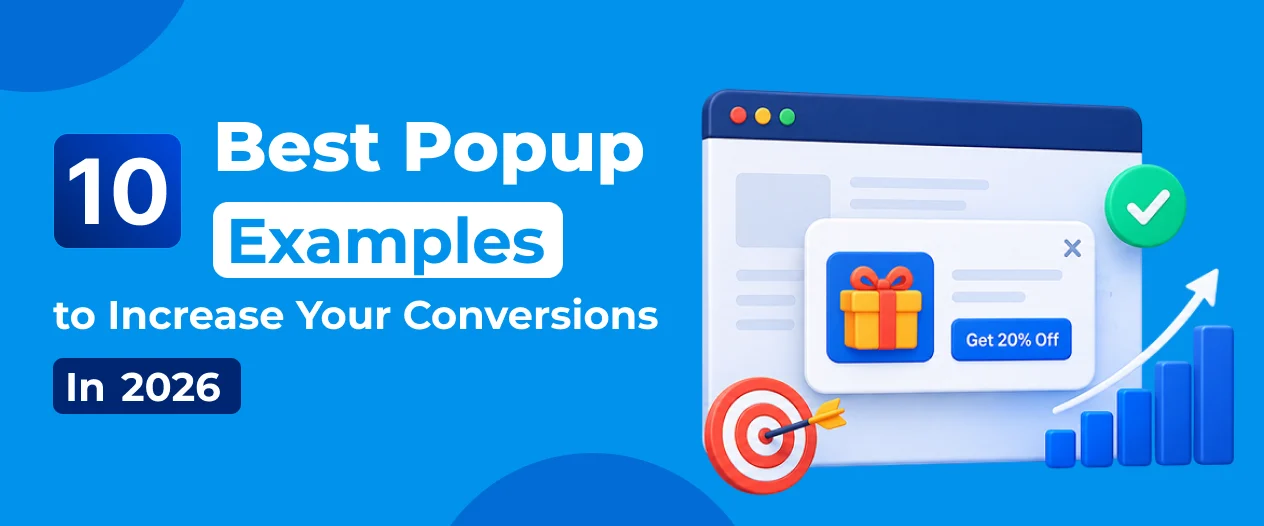
10 Best Popup Examples to Increase Your Conversions in 2026

- Key Takeaways
- What’s Covered in This Guide
- Why High-Converting Popups Matter
- What Makes a Popup Convert?
- 1. Welcome Popup Example
- 2. Exit-Intent Popup Example
- 3. Email Newsletter Popup Example
- 4. First Purchase Discount Popup Example
- 5. Spin-the-Wheel Popup Example
- 6. Limited-Time Offer Popup Example
- 7. Cart Abandonment Popup Example
- 8. Lead Magnet Popup Example
- 9. Social Proof Popup Example
- 10. Multi-Step Popup Example
- Popup Examples Comparison Table
- Are Popups Bad for SEO? The 2026 Answer
- Best Practices for Creating High-Converting Popups
- Common Popup Mistakes to Avoid
- How to Choose the Right Popup Type for Your Goal
- Frequently Asked Questions
- Conclusion
Quick answer: The highest-converting popup examples in 2026 are cart abandonment popups, exit-intent discount popups, and multi-step (conversational) popups — all of which use behavioral triggers instead of showing immediately on page load. The average popup converts at roughly 4.8% of displays, but well-targeted campaigns using these formats regularly reach 10–20%+.
Introduction
Have you ever visited a website, browsed a few products, and then suddenly received a discount offer just before leaving?
That’s a popup.
While many website owners worry that popups might annoy visitors, the reality is quite different. When used correctly, popups remain one of the most effective conversion rate optimization (CRO) tools available for WordPress websites — and the data backs it up. Recent industry benchmarks put the average popup conversion rate at around 4.8%, with top-performing campaigns reaching well into double digits.
Whether your goal is collecting email subscribers, generating leads, promoting offers, reducing cart abandonment, or increasing sales, the right popup can make a significant difference. The challenge is that most website owners don’t know which popup type to use, when to show it, or how to avoid the mistakes that turn a popup from a conversion tool into a bounce-rate problem.
A welcome popup might work perfectly for one website, while an exit-intent popup could generate better results for another. The key is understanding the purpose behind each popup format and matching it to your specific business goal and traffic type.
In this guide, we’ll explore 10 proven popup examples that businesses use to increase conversions, grow email lists, and generate more revenue in 2026 — including current conversion benchmarks, when each format works best, and how popups interact with Google’s mobile SEO rules.
Key Takeaways
- The average popup converts at roughly 4.8% of displays; cart abandonment and conversational popups can exceed 15%.
- Popups with 1–3 form fields consistently outperform longer forms — every extra field reduces completion rate.
- Mobile popups now convert higher than desktop popups (4.98% vs. 3.67%) when properly sized and timed.
- Popups do not hurt SEO by default — only “intrusive interstitials” that block content immediately on mobile after a search-result click are penalized by Google.
- Behavioral triggers (exit intent, scroll depth, time on page, cart activity) consistently outperform popups shown immediately on page load.
- Gamified formats like spin-the-wheel popups convert 2–10x better than static popups in some studies.
What’s Covered in This Guide
- Why High-Converting Popups Matter
- What Makes a Popup Convert?
- 10 Best Popup Examples
- Popup Examples Comparison Table
- Are Popups Bad for SEO?
- Best Practices for High-Converting Popups
- Common Popup Mistakes to Avoid
- How to Choose the Right Popup Type
- FAQ
Why High-Converting Popups Matter

Many website owners focus heavily on driving traffic through SEO, social media, and paid advertising. However, attracting visitors is only half the battle — if they leave without taking action, your marketing spend produces limited return.
This is where popups become valuable: a well-designed popup converts existing visitors into subscribers, leads, or customers without requiring a single additional visit.
Consider the math. If your website receives 10,000 visitors a month and converts 1% of them, you’ll generate 100 conversions. If strategic popups raise your on-site conversion rate to 3%, you’ll generate 300 conversions — three times the results, from the same traffic, at no added acquisition cost.
Popups can help you:
- Grow your email subscriber list
- Capture qualified leads
- Reduce website and cart abandonment
- Recover lost sales
- Promote limited-time offers
- Increase average order value
- Improve customer engagement and retention
Modern popup tools also let you target visitors by behavior, page views, device type, location, and on-site actions — so instead of showing the same message to everyone, you can deliver a relevant offer at the moment it’s most likely to land.
What Makes a Popup Convert?
Before exploring popup examples, it helps to understand what separates high-converting popups from the kind visitors instantly close.
1. A Clear Value Proposition
Visitors should understand what’s in it for them within seconds.
- Weak offer: “Subscribe to our newsletter.”
- Strong offer: “Get 15% Off Your First Order.”
The stronger the perceived value, the higher the conversion rate.
2. Perfect Timing
Timing often matters more than design. Showing a popup immediately after page load interrupts the experience before a visitor has decided whether your content is worth their attention — and, as covered later in this guide, can trigger an SEO penalty on mobile.
Instead, trigger popups based on:
- Exit intent
- Scroll percentage
- Time spent on page
- Cart activity
- User engagement signals
3. Simple Design
The most effective popups are usually the simplest: a clear headline, a short description, one call-to-action, and minimal visual distraction. Popups with 1–3 form fields consistently outperform longer ones — each additional field measurably lowers completion rate.
4. Strong Call-to-Action
Your CTA button should tell visitors exactly what happens next:
- Get My Discount
- Download Free Guide
- Claim My Offer
- Start Free Trial
Avoid generic buttons like “Submit.”
5. Mobile Optimization
The majority of website traffic now comes from mobile devices, and mobile popups currently convert higher than desktop popups when done well. Your popup should:
- Load quickly, without slowing page speed or Core Web Vitals
- Be easy to close with a clearly visible “X”
- Fit smaller screens without covering the full viewport
- Avoid blocking navigation or primary content
A poor mobile experience doesn’t just reduce conversions — it can also trigger Google’s intrusive interstitial penalty, covered in detail below.
Now let’s look at real popup examples that consistently deliver results in 2026.
1. Welcome Popup Example
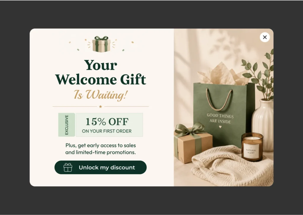
What Is a Welcome Popup?
A welcome popup appears when a visitor lands on your website for the first time. Its primary goal is to introduce your brand and give the visitor a reason to take action before they leave. Typical offers include discounts, free resources, newsletter subscriptions, free shipping, or exclusive deals.
Why It Works
First impressions matter. When visitors arrive, they’re actively evaluating whether your content, products, or services are worth their attention. A well-crafted welcome popup provides an immediate incentive to stay engaged instead of leaving after a single page.
Best for: Ecommerce stores, SaaS businesses, blogs, online courses, service-based businesses
Example:
- Headline: Welcome! Enjoy 15% Off Your First Order
- Description: Join thousands of happy customers and unlock your exclusive discount today.
- CTA button: Get My Discount
Pro tips:
- Delay popup appearance by 5–10 seconds, or trigger on scroll rather than instantly.
- Use a strong, specific incentive rather than a vague ask.
- Show only to new visitors — use cookies or session data to suppress it for returners.
- Keep forms to a single field where possible.
How to create this popup with YS LeadGen: Choose a popup template, customize your message, set display conditions for new visitors, and connect your email marketing platform to start collecting leads automatically.
2. Exit-Intent Popup Example
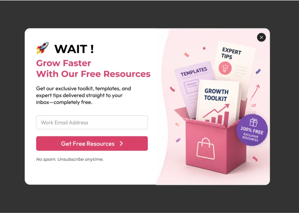
What Is an Exit-Intent Popup?
An exit-intent popup appears when a visitor’s cursor behavior signals they’re about to leave the page — moving toward the back button or browser tab bar. Instead of interrupting active browsing, it waits until the visitor is already exiting, giving you one final opportunity to capture their attention.
Why It Works
Not every visitor is ready to buy on their first visit — some are comparing prices, researching, or simply browsing. An exit-intent popup offers a compelling reason to stay connected. Even without an immediate purchase, you can capture an email and nurture the visitor into a future customer. Industry data consistently shows exit-intent popups converting around 3.9% on average, with much higher rates when combined with cart activity (see #7 below).
Best for: Ecommerce stores, SaaS websites, lead generation websites, online course creators, membership sites
Example:
- Headline: Wait! Before You Go…
- Description: Get 10% off your first order when you subscribe today.
- CTA button: Claim My Discount
Pro tips:
- Use a genuinely valuable offer, not a token discount.
- Keep the message short and immediately scannable.
- Cap display frequency — showing this repeatedly to the same visitor erodes trust.
- Test different offers and headlines against each other.
How to create this popup with YS LeadGen: Select the exit-intent trigger, customize your offer, and start recovering potential leads before they leave the page.
3. Email Newsletter Popup Example
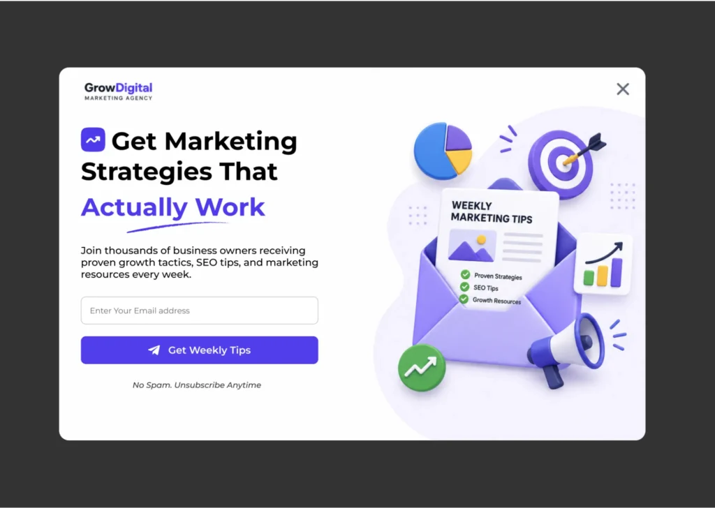
What Is an Email Newsletter Popup?
A newsletter popup encourages visitors to subscribe to your mailing list rather than asking for an immediate purchase, focusing instead on building a long-term relationship through email marketing. It’s one of the most widely used popup examples on the web.
Why It Works
Email remains one of the highest-ROI marketing channels. Unlike social media reach, you own your email list and can communicate directly with subscribers on your own schedule. A newsletter popup turns anonymous traffic into an owned marketing asset.
Best for: Bloggers, ecommerce stores, SaaS businesses, news websites, educational websites
Example:
- Headline: Join 25,000+ Smart Marketers
- Description: Get weekly growth tips, marketing insights, and exclusive resources delivered to your inbox.
- CTA button: Subscribe Free
Pro tips:
- Lead with a specific, tangible benefit — not just “stay updated.”
- Explain exactly what subscribers will receive and how often.
- Ask only for an email address; extra fields at this stage reduce signups.
- Cite real subscriber numbers when you have them — social proof lifts conversion.
How to create this popup with YS LeadGen: Build a simple email capture form, connect it to your email marketing platform, and display it based on visitor behavior to maximize subscriptions.
4. First Purchase Discount Popup Example
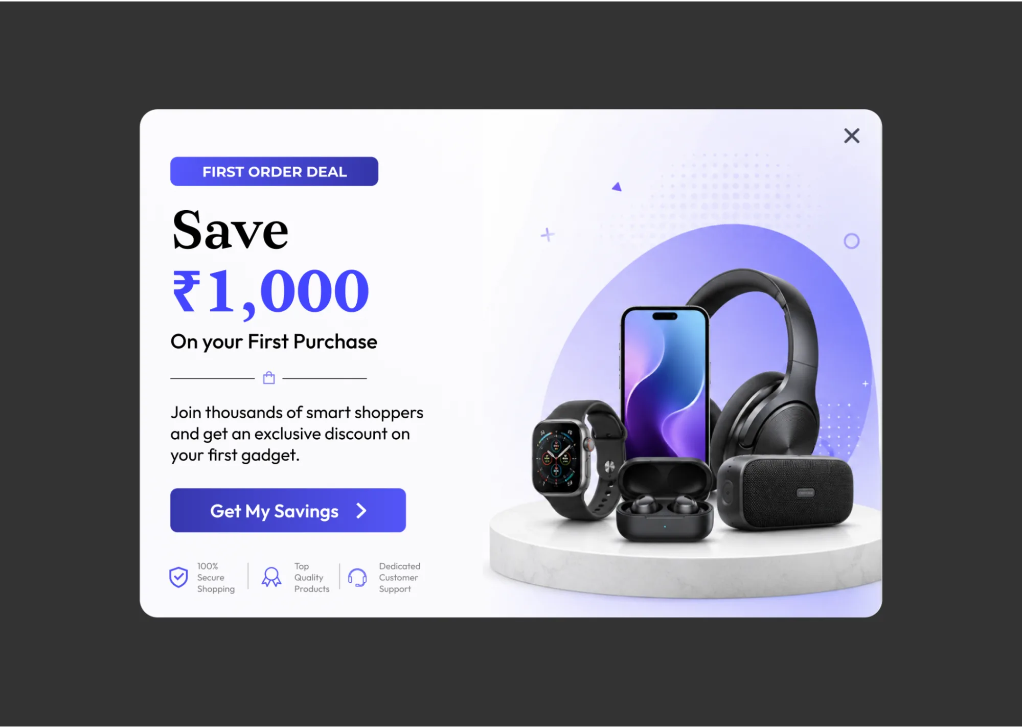
What Is a First Purchase Discount Popup?
This popup offers new visitors a special discount on their first order, aimed directly at reducing purchase hesitation.
Why It Works
New visitors often need a nudge before completing a purchase. A discount creates urgency and gives shoppers a concrete reason to choose your store over a competitor’s — even a modest percentage-off offer can meaningfully increase conversion rate.
Best for: Fashion stores, beauty brands, electronics stores, home decor websites, DTC ecommerce brands
Example:
- Headline: Unlock 15% Off Your First Order
- Description: Sign up now and enjoy exclusive savings on your first purchase.
- CTA button: Get My Coupon
Pro tips:
- Percentage-based discounts generally outperform flat-dollar offers for higher-priced carts.
- Auto-apply or auto-display the coupon code rather than emailing it separately.
- Set a visible expiration date to reinforce urgency.
- Restrict display to genuinely new visitors only.
How to create this popup with YS LeadGen: Create a discount popup, add your coupon code, configure targeting rules, and display it to first-time visitors for maximum impact.
5. Spin-the-Wheel Popup Example
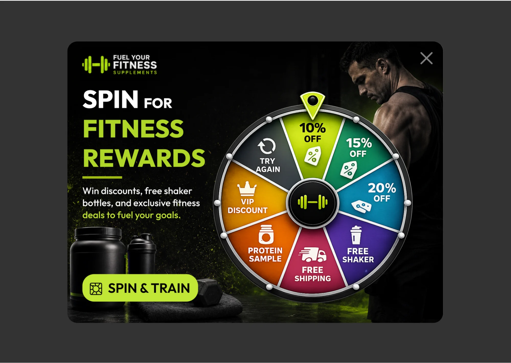
What Is a Spin-the-Wheel Popup?
A spin-the-wheel popup gamifies lead generation — visitors spin a virtual wheel for rewards such as discounts, free shipping, or bonus gifts.
Why It Works
People engage more with interactive experiences than static forms. The anticipation of winning increases engagement and motivates visitors to hand over their email address in exchange for a chance to play. Gamified popups have been shown to convert several times better than standard static popups.
Best for: Ecommerce websites, seasonal promotions, holiday campaigns, product launches
Example:
- Headline: Spin & Win Exclusive Rewards
- Description: Enter your email and spin the wheel for a chance to win discounts up to 30%.
- CTA button: Spin Now
Pro tips:
- Offer realistic, honest rewards — inflated prizes damage trust fast.
- Keep the wheel to 4–6 segments; too many options dilute perceived odds.
- Limit spins to one per visitor to prevent abuse.
- Use strong visual design — this format lives or dies on presentation.
How to create this popup with YS LeadGen: Use YS LeadGen’s interactive popup builder to create engaging promotional campaigns that encourage participation and conversion.
6. Limited-Time Offer Popup Example
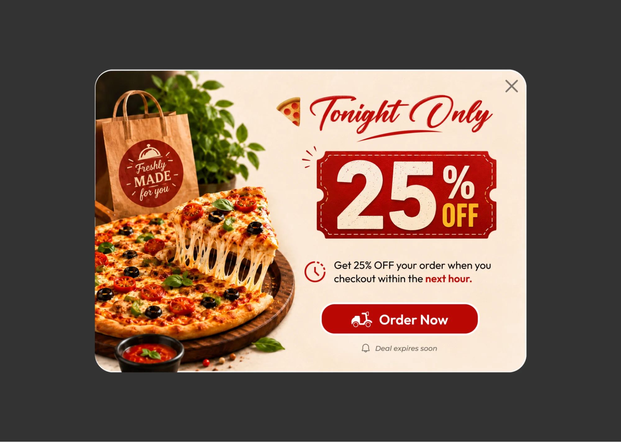
What Is a Limited-Time Offer Popup?
This popup promotes a deal that expires after a defined period, typically reinforced with a countdown timer.
Why It Works
Urgency is one of the most reliable conversion triggers in marketing. When visitors know an offer expires soon, they’re more likely to act immediately rather than procrastinate and forget.
Best for: Flash sales, holiday promotions, product launches, seasonal campaigns
Example:
- Headline: Flash Sale Ends Tonight
- Description: Save 20% before this exclusive offer disappears.
- CTA button: Shop Now
Pro tips:
- Use a real, visible countdown timer.
- Be honest about deadlines — fake urgency erodes long-term trust and repeat business.
- Keep messaging tight; urgency copy shouldn’t require re-reading.
- State the savings clearly, in both percentage and dollar terms where possible.
How to create this popup with YS LeadGen: Set your campaign deadline, add urgency-focused messaging, and display the popup strategically during promotional periods.
7. Cart Abandonment Popup Example
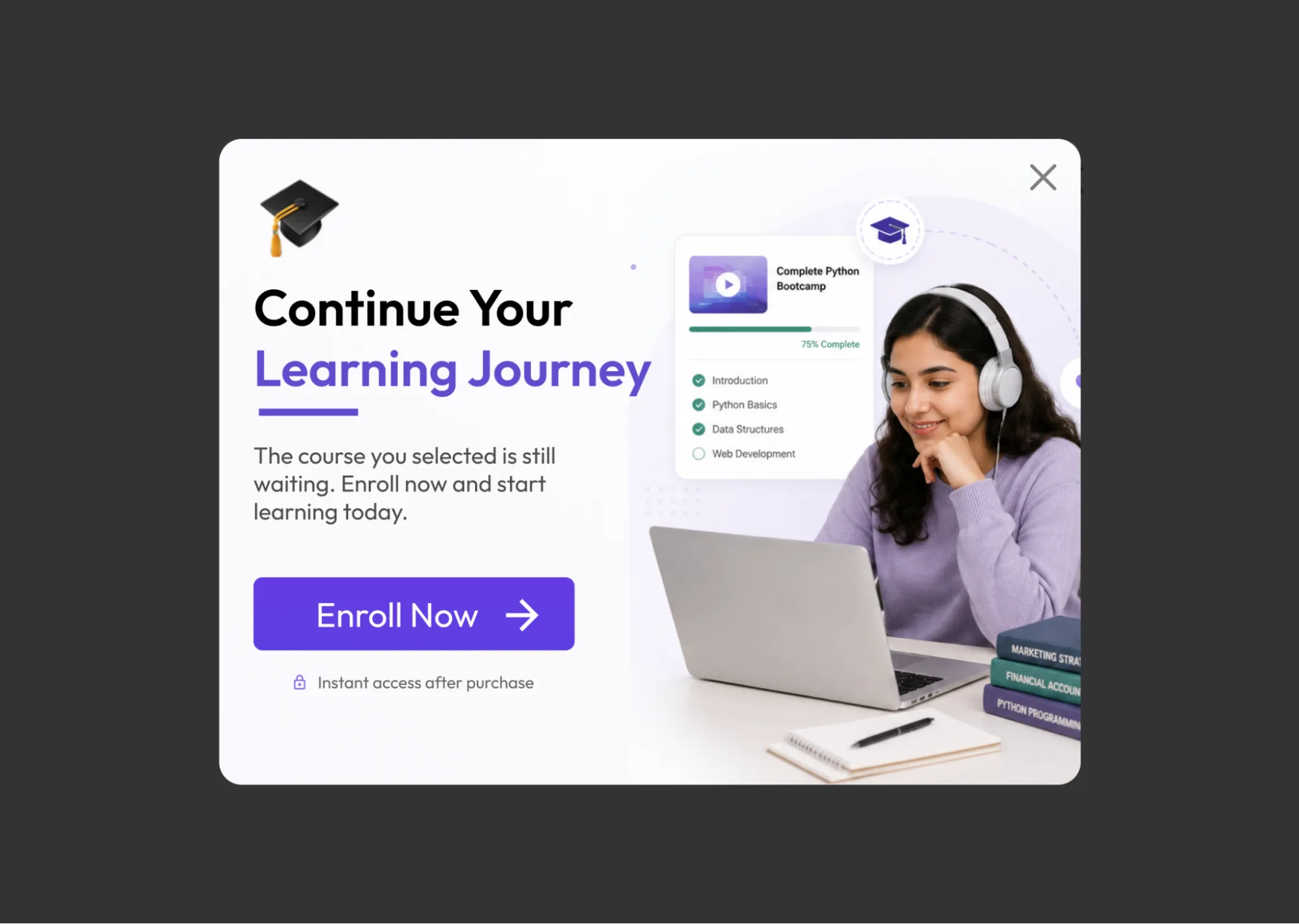
What Is a Cart Abandonment Popup?
A cart abandonment popup appears when a shopper attempts to leave the site with items still in their cart, aiming to recover a sale that’s otherwise about to be lost.
Why It Works
Many shoppers abandon carts due to distractions, shipping cost concerns, or last-minute price comparisons. A well-timed popup can directly address the objection — often shipping cost — and bring the customer back to checkout. This is consistently the highest-converting popup format across independent studies, with some benchmark reports showing average conversion rates well above 15% for this use case specifically, since it targets visitors who have already shown strong purchase intent.
Best for: WooCommerce stores, Shopify stores, ecommerce brands, online retailers
Example:
- Headline: Don’t Leave Empty-Handed
- Description: Complete your order today and enjoy free shipping.
- CTA button: Complete Purchase
Pro tips:
- Free shipping is often a stronger lever than a percentage discount for cart recovery.
- Reserve discounts for genuinely price-sensitive segments rather than offering one by default.
- Reiterate product benefits, not just the offer.
- Reduce checkout friction as a companion fix — a great popup can’t fix a broken checkout flow.
How to create this popup with YS LeadGen: Target visitors with active carts and display personalized offers that encourage them to complete their purchase.
8. Lead Magnet Popup Example
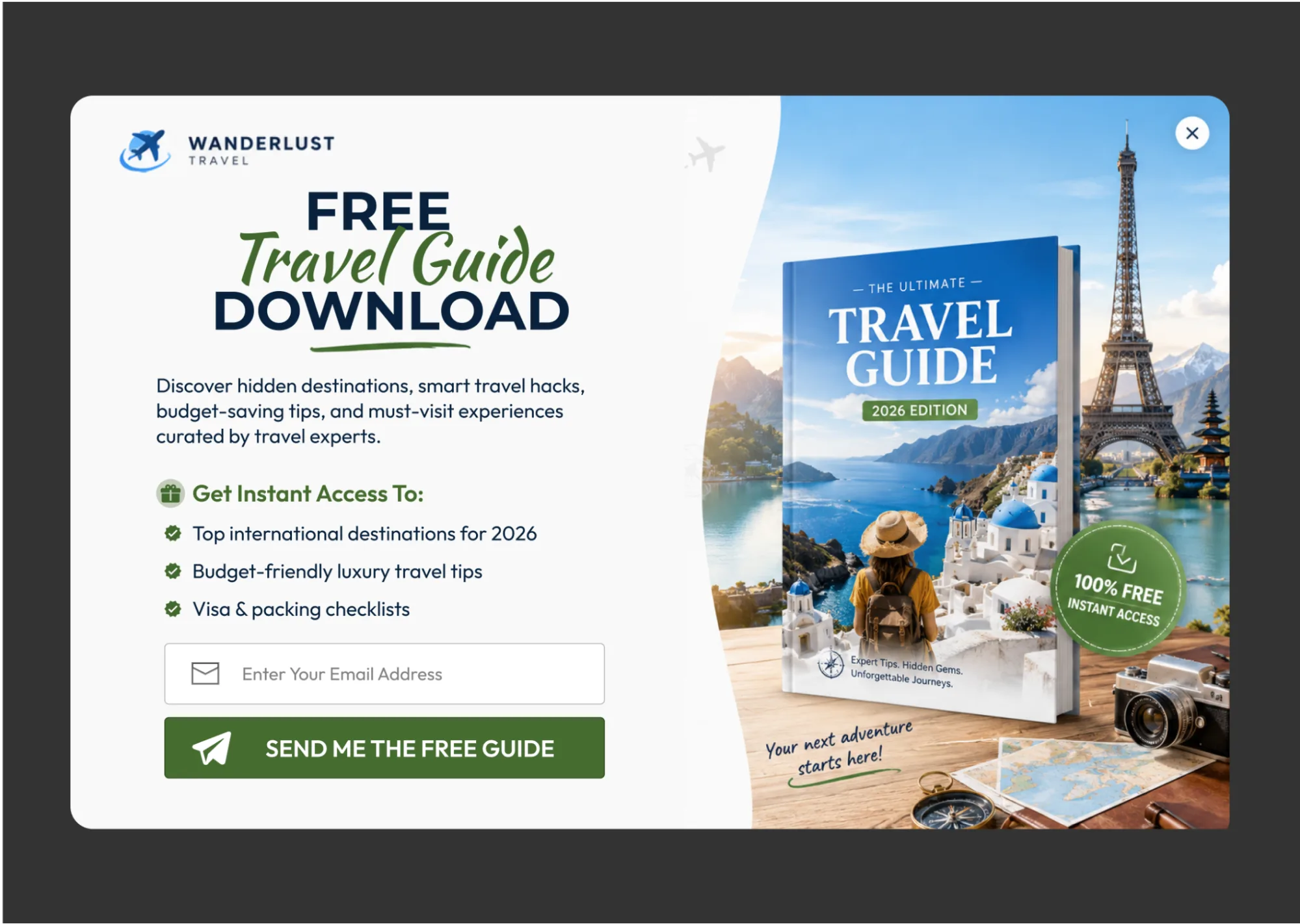
What Is a Lead Magnet Popup?
A lead magnet popup offers a piece of valuable content — an eBook, checklist, template, guide, webinar, or case study — in exchange for a visitor’s contact details.
Why It Works
Visitors are far more willing to share their information when they receive immediate, tangible value in return. A strong, specific lead magnet generates higher-quality leads than a generic “subscribe” ask.
Best for: SaaS businesses, agencies, consultants, coaches, B2B companies
Example:
- Headline: Download the Ultimate SEO Checklist
- Description: Get a proven step-by-step checklist used by top-performing websites.
- CTA button: Download Free
Pro tips:
- Solve one specific, narrow problem rather than a broad topic.
- Keep the resource genuinely actionable, not just informational.
- Invest in professional design — a lead magnet is a first impression of your product quality.
- Deliver the content instantly to avoid drop-off between signup and delivery.
How to create this popup with YS LeadGen: Upload your resource, connect your email provider, and automatically deliver downloads after signup.
9. Social Proof Popup Example
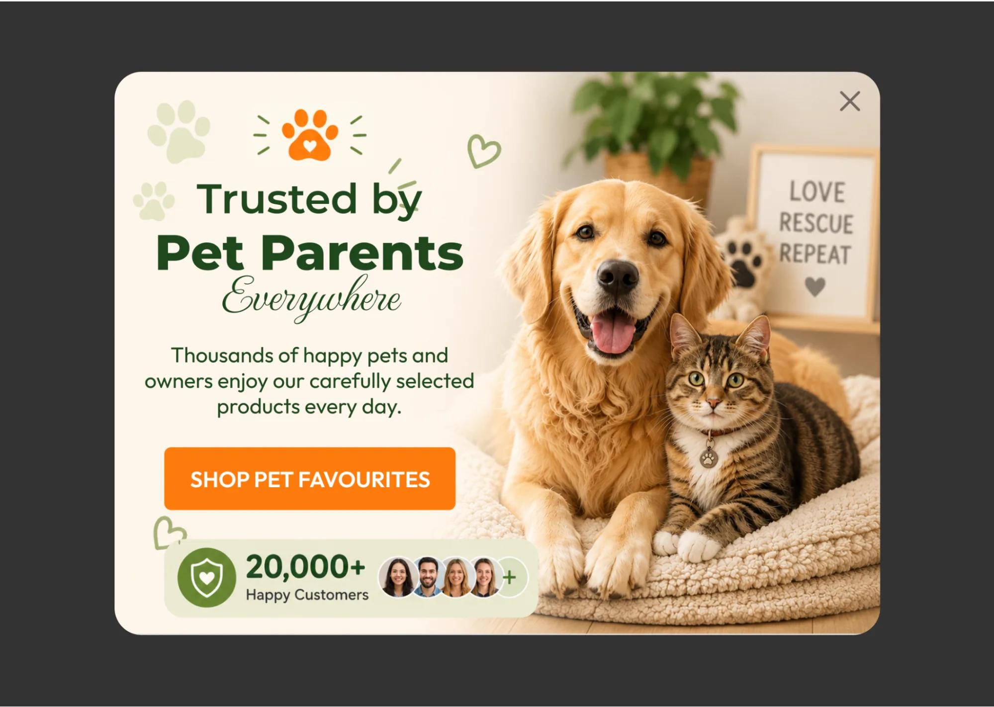
What Is a Social Proof Popup?
A social proof popup surfaces customer activity, reviews, testimonials, or recent purchases — small, often corner-anchored notifications rather than full-screen overlays.
Why It Works
People look to others’ behavior when making decisions, especially with unfamiliar brands. When visitors see evidence that others already trust your business, they feel more confident taking action themselves.
Best for: Ecommerce stores, SaaS products, service businesses, membership sites
Example:
- Headline: Trusted by 15,000+ Customers
- Description: Join thousands of customers who use our products every day.
- CTA button: Get Started
Pro tips:
- Use real, verifiable customer data — never fabricate numbers.
- Highlight specific, credible reviews over generic praise.
- Keep notifications small and unobtrusive, not full-screen.
- Cap frequency; showing the same notification repeatedly feels manipulative rather than reassuring.
How to create this popup with YS LeadGen: Display testimonials, customer counts, and social proof elements that increase visitor confidence and improve conversions.
10. Multi-Step Popup Example
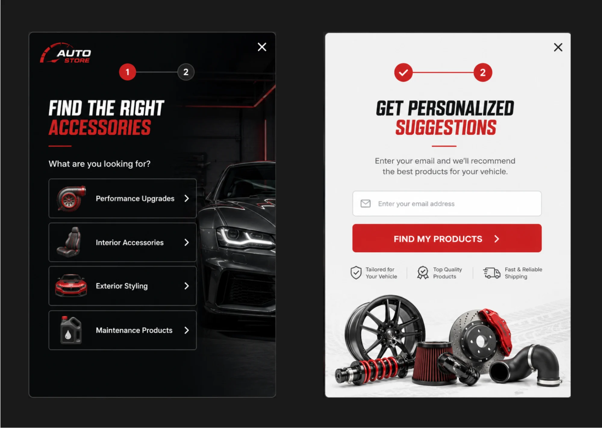
What Is a Multi-Step Popup?
A multi-step (or conversational) popup breaks the conversion process into smaller stages instead of asking for information all at once — typically a quick question first, followed by the contact field.
Why It Works
Smaller commitments feel easier to make. Once a visitor answers a simple, low-friction first question, they’re more psychologically invested and likely to complete the second step. This approach consistently improves both lead quality and conversion rate — some data shows multi-step popups converting over 10% higher than single-step equivalents, and conversational formats have reported conversion rates well above 15% in independent studies.
Best for: Lead generation websites, service businesses, agencies, SaaS companies
Example:
- Step 1: What is your biggest marketing challenge?
- Step 2: Enter your email to receive personalized recommendations.
- CTA button: Get My Recommendations
Pro tips:
- Keep each step genuinely simple — one decision per screen.
- Ask only what’s necessary to personalize the next step.
- Show a progress indicator so visitors know how much is left.
- Front-load value: the first step should feel like it’s already helping them, not just qualifying them.
How to create this popup with YS LeadGen: Build multi-step forms that guide visitors through a frictionless conversion journey while collecting valuable lead information.
Popup Examples Comparison Table
| Popup Type | Best For | Typical Trigger | Conversion Potential |
|---|---|---|---|
| Welcome Popup | Lead Generation | Page load (delayed) | High |
| Exit-Intent Popup | Recover Visitors | Exit intent | Very High |
| Newsletter Popup | Email Growth | Scroll / time delay | High |
| Discount Popup | Sales | New-visitor detection | Very High |
| Spin Wheel Popup | Engagement | Page load (delayed) / click | High |
| Limited-Time Popup | Promotions | Scheduled campaign | High |
| Cart Abandonment Popup | Revenue Recovery | Exit intent + cart activity | Very High |
| Lead Magnet Popup | B2B Lead Generation | Scroll / time delay | High |
| Social Proof Popup | Trust Building | Page load / scroll | Medium to High |
| Multi-Step Popup | Qualified Leads | Click / scroll | Very High |
Are Popups Bad for SEO? The 2026 Answer
This is one of the most common concerns website owners have, and the honest answer is: it depends entirely on implementation, not on whether you use a popup at all.
Google’s intrusive interstitial guidelines — first introduced in 2017 and still enforced today — only penalize popups that block main content immediately on mobile, specifically right after a visitor clicks through from a Google search result. A popup is at risk of a ranking penalty if it:
- Covers the majority of the screen immediately when a visitor lands on the page from search
- Must be dismissed before any content is visible
- Appears while a visitor is still reading, without a clear or easy way to close it
Popups that are exempt from this penalty include:
- Legally required interstitials (cookie consent, age verification)
- Login walls on non-indexable pages
- Small, easily dismissible banners (like app-install prompts)
- Popups triggered by user engagement — scroll, click, time delay, or exit intent — rather than shown instantly
In practice, this means every popup type covered in this guide is safe from an SEO standpoint as long as it’s triggered after engagement, not on immediate page load, and stays under roughly 30% of the mobile viewport with a clearly visible close button. This is also exactly why behavioral triggers — the theme running through every example above — matter for more than just conversion rate; they’re the difference between a popup that helps your site and one that quietly damages it in mobile search.
Poorly optimized popup scripts can also slow down page load and hurt Core Web Vitals, which is a separate but related ranking factor — so choosing a lightweight, well-coded popup builder matters as much as the trigger rules themselves.
Best Practices for Creating High-Converting Popups
Focus on one goal. Every popup should have a single objective. Trying to collect leads, promote products, and gather feedback simultaneously dilutes all three.
Use behavioral triggers. Show popups based on visitor actions — scroll, exit intent, time on page, cart activity — instead of displaying them immediately.
Design for mobile first. Ensure popups load quickly, dismiss easily, and never cover the full screen on smartphones and tablets.
Write strong, specific headlines. Visitors decide within seconds whether a popup is worth their attention — vague headlines get closed instantly.
A/B test everything. Test headlines, offers, colors, triggers, and CTA button copy continuously; even small wording changes can shift conversion rate meaningfully.
Keep forms short. Every additional field reduces completion rate — ask only for what you’ll actually use.
Common Popup Mistakes to Avoid
- Showing popups immediately after page load
- Asking for too much information upfront
- Using weak, generic offers (“Subscribe to our newsletter”)
- Displaying the same popup too frequently to the same visitor
- Ignoring the mobile experience entirely
- Using distracting animations or cluttered designs
- Using vague CTA buttons like “Submit” or “OK”
- Covering the full mobile viewport immediately after a search-result click (risking Google’s interstitial penalty)
Avoiding these mistakes can dramatically improve both your conversion rate and your search visibility.
How to Choose the Right Popup Type for Your Goal
If you’re not sure where to start, match your primary objective to the format:
- Growing an email list → Newsletter popup or welcome popup
- Recovering an abandoning visitor → Exit-intent popup
- Recovering an abandoned cart → Cart abandonment popup
- Driving a first purchase → First purchase discount popup
- Generating B2B leads → Lead magnet popup or multi-step popup
- Building trust with new visitors → Social proof popup
- Boosting engagement during a campaign → Spin-the-wheel popup or limited-time offer popup
Most websites don’t need all ten types running at once — starting with one or two that match your actual traffic and testing before adding more will produce cleaner, more reliable data.
Frequently Asked Questions
Which popup converts the best?
Cart abandonment popups and conversational (multi-step) popups tend to convert highest across independent studies, since both target visitors who have already shown strong intent. Exit-intent popups combined with cart activity often outperform either trigger alone.
Are popups bad for SEO?
Not inherently. Google only penalizes "intrusive interstitials" that block content immediately on mobile after a search-result click. Popups triggered by scroll, time delay, or exit intent — and sized to cover less than roughly 30% of the mobile viewport — are not penalized.
How many popups should a website have?
There's no fixed number, but running more than one or two active campaigns per page risks popup fatigue and can hurt both conversion rate and user experience. Start with one high-priority goal per page and expand based on results.
How many form fields should a popup have?
As few as possible. Data consistently shows 1–3 field popups outperforming longer forms — each additional field lowers completion rate. Save additional questions for a second step (see multi-step popups) rather than a longer single form.
Do exit-intent popups work on mobile?
Not in the traditional cursor-tracking sense, since mobile has no mouse movement to detect. Mobile-friendly alternatives include scroll-based, time-delayed, or back-button-triggered popups that approximate the same "about to leave" signal.
Can I create these popup examples with YS LeadGen?
Yes. YS LeadGen includes templates and triggers for every format in this guide — welcome, exit-intent, newsletter, discount, spin-the-wheel, limited-time, cart abandonment, lead magnet, social proof, and multi-step popups — with built-in targeting and email platform integrations.
Conclusion
The difference between an average website and a high-converting website often comes down to how effectively it captures visitor attention at the right moment.
The popup examples in this guide have been proven across thousands of websites and industries, and the underlying principle is consistent: the highest-converting formats — cart abandonment, exit-intent, and multi-step popups — all share the same trait. They trigger based on visitor behavior rather than showing indiscriminately, and they ask for the minimum information necessary at each step.
Start with a Welcome Popup, Exit-Intent Popup, or First Purchase Discount Popup, measure the results against your own baseline rather than an industry average, and continue optimizing from there.
With the right strategy and a powerful popup builder like YS LeadGen, you can transform more visitors into subscribers, leads, and customers — without increasing your traffic budget or risking your mobile search rankings.
Ready to build your first high-converting popup? Install YS LeadGen and launch your first campaign directly from your WordPress dashboard.
About the author

YSLeadGen Pro - Lifetime Deal
Access to unlimited popups, advanced targeting, event triggers, and premium templates.
14-Days Risk Free Money Back Guarantee